
7 Web Design Principles That Make Your Website Look Premium
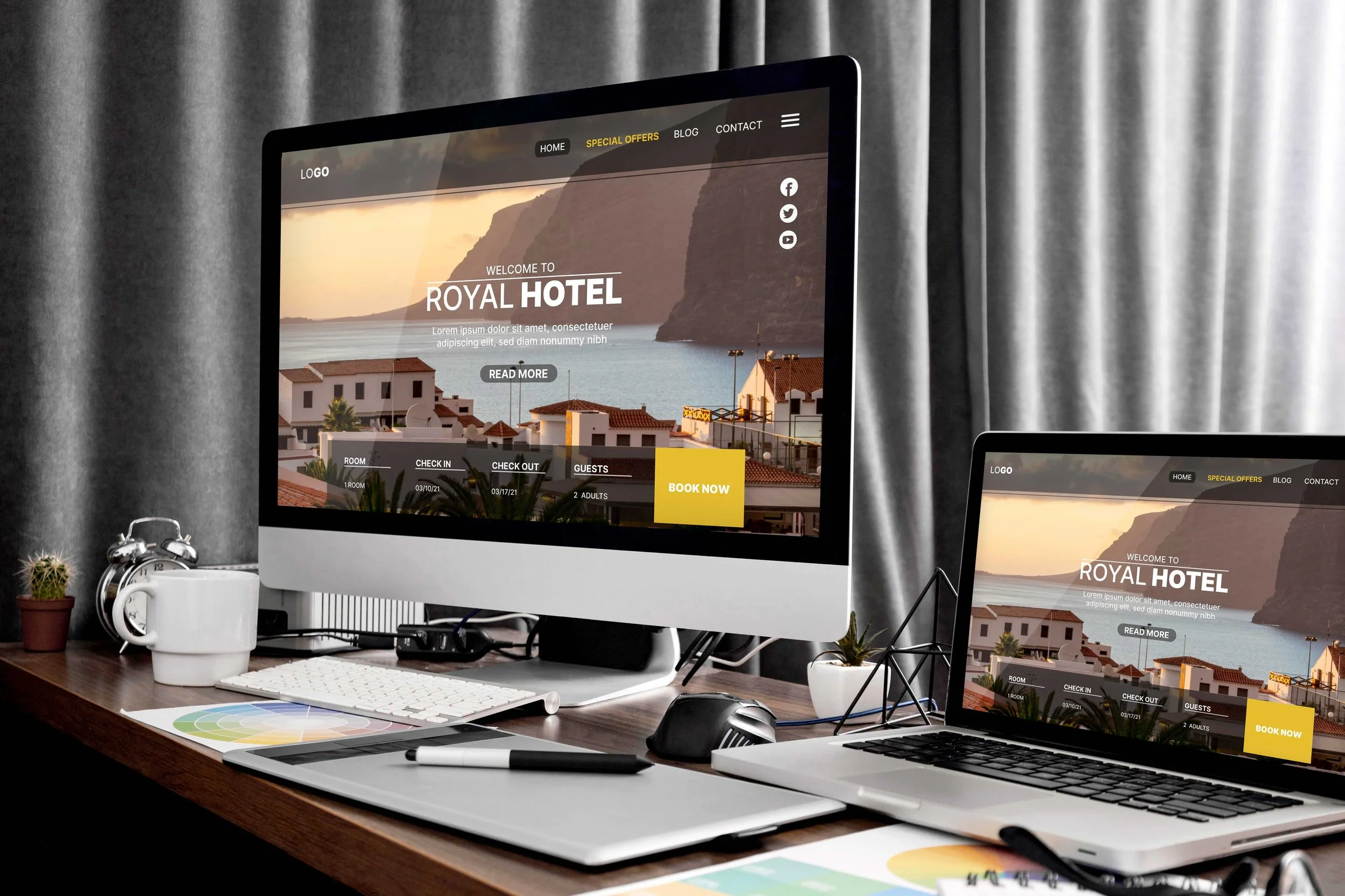
You can choose a beautiful Squarespace template, upload your logo and add your services, yet still feel that something looks unfinished.
Sometimes the headings are too similar in size. Sometimes the photos feel unrelated. Or the desktop layout looks great, but the mobile version has awkward gaps and a button that gets lost halfway down the page.
A premium-looking website comes from making these details work together. Visitors should be able to understand your business, find what they need and take the next step comfortably.
These seven web design principles will help you review your website with a clearer eye. For each one, you’ll find a practical change you can make on your Squarespace site and a quick way to check the result.
1. Give Every Page a Clear Visual Priority
Before adjusting your design, decide what the page needs to communicate first.
On a service page, that might be the problem you solve and who you help. On a portfolio page, it could be your strongest project. On a booking page, availability and appointment details deserve attention.
When your headline, announcement bar, image and three different buttons all compete, visitors have to decide where to look. A clear priority makes that decision easier.
Imagine a bookkeeping business opening with “Welcome to Our Website.” That heading takes up valuable space without explaining much. “Bookkeeping for Independent Retailers” gives the design a more useful starting point. A short description can explain the service, followed by a clear “Book an Introductory Call” button.
Try this in Squarespace: Review your first section. Make the main message prominent, keep supporting information shorter, and give the primary action more emphasis than secondary links. You can still offer another route, such as viewing your services, without giving both actions identical visual weight.
2. Use More White Space
If your website feels crowded, give the content more room. Generous white space around headings, images and sections can make a page feel calmer and more refined.
White space is the empty area between elements. It does not have to be white: the same principle applies to a cream, coloured or dark background. Its purpose is to help visitors focus on one part of the page at a time.
For example, a service section with a heading, paragraph, photo and button can feel cramped when everything sits close together. Increase the space around that group, keep the heading near its description, and give the button enough room to stand out.
Start with these adjustments:
Add more space above and below your main sections.
Leave comfortable margins around text and images.
Separate different topics with a larger gap than you use between related items.
Keep paragraphs at a comfortable reading width.
Let a strong photograph stand on its own without surrounding it with unnecessary decoration.
Try this in Squarespace: Increase section padding where the page feels crowded, then use the grid to align text, images and buttons. Review the mobile layout separately so generous desktop spacing does not become a long empty stretch on a phone.
3. Choose Images That Support the Business
Photography can make a website feel distinctive, but filling every available space with images rarely improves the result.
Choose visuals that help visitors understand your work. For a salon, that could mean the interior, the team and examples of services. For a builder, project photographs and details of the finished work are more useful than unrelated stock photos.
Consistency matters here too. Mixing dark, dramatic photography with bright, heavily filtered images can make neighbouring sections feel disconnected.
Try this in Squarespace: Review related images as a group. Use compatible crops and proportions for comparable content. Check where faces, products and important details fall when images are cropped on smaller screens.
Prepare appropriately sized images before uploading. My Squarespace image size guide can help you review your assets.
Quick check: For each image, ask what a visitor learns from it. Replace images that add visual noise without useful context.
4. Give Your Colours Clear Roles
A professional website can be colourful, understated or somewhere in between. What matters is how consistently the palette is used.
Let spacious, uncluttered backgrounds occupy much of the page, then use your brand colours to highlight selected elements. White space gives those colours room to stand out; every section does not need a new background colour.
Give your colours jobs. You might use a light neutral for most backgrounds, a dark colour for body text, a brand colour for important buttons and a softer supporting shade for selected sections.
For example, a landscape designer could use an off-white background, charcoal text and a deep green booking button. The green becomes useful because it consistently identifies an action.
Check readability before settling on subtle colour combinations. WCAG’s minimum text-contrast guidance calls for a ratio of at least 4.5:1 for ordinary text and 3:1 for large text, subject to its stated exceptions. Pale text on a pale background may look delicate but be difficult to read. See W3C’s contrast guidance.
Try this in Squarespace: Review the colour themes used across your sections, including button labels and links. Test text over photographs against the lightest and darkest areas behind it.
For inspiration, explore these luxurious colour palette ideas. To apply your chosen button colours, use my Squarespace button colour guide.
Quick check: Can visitors identify clickable elements, and can you comfortably read every text colour against its background?
5. Place Social Proof Where It Matters Most
Visitors may like the look of your website and still need reassurance before getting in touch. Social proof helps them see that other people have trusted your business and had a positive experience.
Bring that reassurance into the pages where visitors are considering your services. A separate testimonials page can be useful, but relevant proof also deserves a place beside the decisions it supports.
Client logos directly beneath your hero section
A small row of client logos can introduce your experience early in the visit. Use a clear label such as “Selected Clients” and leave enough space between the logos to keep the section tidy. Adjust their displayed sizes so one logo does not overwhelm the others.
Testimonials beside pricing
When someone reviews your pricing, they are also considering the value of your service. Place a relevant testimonial nearby that describes the client's experience, the problem you helped solve or a specific outcome. A detailed comment is more useful here than a vague “Great service!”
Star ratings near enquiry forms
A genuine review rating near your form can provide reassurance just before a visitor contacts you. Include the review source and number of reviews so the rating has context, and link to the original reviews where possible.
Awards close to key calls-to-action
An industry award or relevant professional recognition can support a booking or enquiry button. Keep the presentation restrained, identify the awarding organisation and include the year where relevant.
Use authentic reviews, awards and client relationships, with permission where needed. Choose the proof most relevant to the decision rather than placing every badge and testimonial together.
Try this in Squarespace: Add a compact client logo section below the hero, then place a short testimonial beside a relevant service package or enquiry section. If you need help with the enquiry setup, follow my guide to adding a contact form in Squarespace.
Quick check: When visitors reach your pricing or contact button, can they also see a reason to feel confident about choosing you?
6. Keep Typography Simple
Your font choices affect the feel of every page. A simple, consistent approach helps your website look professional and makes the content easier to read.
Limit Your Fonts
Keep to one or two font families across your website. You could pair a distinctive heading font with a simple body font, or use different weights of one family throughout.
Avoid introducing a new typeface for every section. Too many competing styles can make a page feel busy, even when the individual fonts look attractive.
Create a Clear Text Hierarchy
Give each type of text a recognisable role:
Large headings introduce the page and its main message.
Medium-sized subheadings break the content into clear topics.
Comfortable body text makes descriptions and longer paragraphs easy to read.
Repeat those styles across your pages. Your Services page and About page should feel like parts of the same website.
Keep Paragraphs Easy to Read
Save decorative or script fonts for short accents where they remain legible. For paragraphs, choose a straightforward font with comfortable line spacing. Check that visitors can read it on a phone without zooming in.
Try this in Squarespace: Set your main font styles in Site Styles, then review several pages together. If you want to use a branded typeface, follow my guide to adding fonts to Squarespace.
Quick check: Can someone scanning the page easily tell the main heading, subheadings and body text apart?
7. Give Mobile Visitors the Same Level of Care
A website’s quality should carry through to the phone experience. That means checking the actual order, spacing and usability of the content, not just whether it fits inside the screen.
In Squarespace 7.1 Fluid Engine sections, you can arrange and resize blocks for the mobile layout. Some settings and content remain shared, so check both views after making changes. Squarespace explains the available controls in its mobile layout guide.
Try this in Squarespace: Review your homepage, a key service page and your enquiry or booking page on a real phone. Read the headings, open the menu, tap the buttons and complete the form.
Look for cropped faces, oversized headings, overlapping elements, unnecessary gaps and pop-ups that obstruct the page. Make sure a sticky header does not take up too much of the available screen.
Also pay attention to waiting. If a decorative video or third-party widget delays access to your content, consider whether it earns its place. Prioritise the information visitors came for.
Quick check: Complete your main customer journey on a phone without zooming, turning the device sideways or hunting for a hidden button.
What These Principles Look Like Together
Imagine a small interior design studio with an uneven homepage: several image styles, three competing buttons, paragraphs stretched across the screen and project details that are difficult to find.
A focused revision could use one representative project image, a specific headline, more white space and just one or two font families. A neat row of client logos could sit below the hero, while a relevant testimonial beside a service package would offer reassurance before the consultation link.
On mobile, the studio would review the order of those elements and make sure project captions stay with the correct images.
This is an illustrative example, not a client case study. It shows how several modest decisions can create a more coherent page without requiring a completely different brand identity.

Need Help with Your Squarespace Website?
Book a free kick-off call to discuss your project requirements in detail. Whether you're launching a new Squarespace website, redesigning an existing one, or looking to improve functionality and user experience, we'll help you explore the best options for your goals.
A Quick Website Design Review
Use this table before publishing a new page or deciding whether your existing site needs a redesign.
| Principle | What to Review | A Useful First Change |
|---|---|---|
| Visual priority | Is the page's main message clear? | Simplify the opening headline and competing actions |
| White space | Does the content have room to breathe? | Increase space around crowded sections and keep related items together |
| Imagery | Do images explain the business? | Replace an irrelevant photo with useful project imagery |
| Colour | Is text readable and colour used consistently? | Use uncluttered backgrounds and consistent accent colours |
| Social proof | Is reassurance visible near important decisions? | Add client logos below the hero and a testimonial beside pricing |
| Typography | Are fonts simple and text levels distinct? | Use one or two font families with clear heading and body styles |
| Mobile experience | Can visitors complete the main task comfortably? | Review layouts and submit a test form on a phone |
Frequently Asked Questions
-
A premium-looking website feels considered from page to page. Typography, spacing, colours and photography work together, while navigation makes the content easy to explore. The appropriate style depends on the business: a premium children’s brand may be bright and playful, while a financial adviser may need a quieter presentation. There is no single luxury colour palette or font that suits every website.
-
Yes. A template provides a starting layout, but your content, image choices and design decisions shape the finished result. Replace placeholder content carefully, keep styling consistent and review the mobile layout. If you’re choosing a starting point, explore my guide to Squarespace templates for small businesses.
-
Many improvements in this guide involve editing content, adjusting layouts and refining styles. Custom code can help with a particular feature or visual treatment, but it should solve a defined problem. Start by making your content clear and your existing layouts consistent before adding more effects to the page.
-
A visual redesign alone does not guarantee better rankings. Search visibility also needs relevant content and appropriate technical setup. Treat design as part of making your website useful, then review search performance separately. My Squarespace SEO guide covers the broader work to consider alongside a redesign.
My Final Thoughts
Start with the page that matters most to your business. Identify what feels unclear, inconsistent or difficult to use, then improve one part at a time. A stronger headline, better image crop or more readable button may be a more useful first change than another decorative effect.
Building or improving a Squarespace website? A polished design is all about getting the details right. Book a free call with me to discuss your website, your goals and how I can help create a professional Squarespace website that makes the next step clear for your visitors.


A slow Squarespace website can make it harder for visitors to explore your services and get in touch. Learn how to identify the cause, improve loading performance, and measure whether your changes are working.