
10 Luxurious Color Palette Ideas for Your Website and Brand
Color is one of the most powerful tools in branding. The right luxurious color palette can instantly communicate elegance, exclusivity, and high value—before a single word is read.
Whether you're designing a website, building a brand, or refining your visual identity, choosing the right luxury branding colors can completely transform how your audience perceives you. Premium brands don’t just “look good” , they feel intentional, refined, and memorable.
In this guide, you’ll discover the best luxurious color combinations, real palette ideas, and how to use them strategically to position your brand as high-end and desirable.
What Makes a Luxurious Color Palette?
A luxurious color palette isn’t about using gold everywhere , it’s about balance, restraint, and emotional impact.
Here are the key traits that define luxury brand colours:
1. Neutral Foundations
Luxury brands often rely on timeless neutrals like beige, ivory, charcoal, and black. These colors create a clean, sophisticated base.
2. Muted & Refined Tones
Instead of bright or loud shades, luxury colors are typically soft, muted, and elegant. Think dusty rose instead of pink, or deep navy instead of blue.
3. High Contrast Pairing
Combining light and dark tones adds depth and drama , essential for a strong luxury brands color palette.
4. Minimal Color Usage
Luxury is often about “less but better.” A limited palette creates clarity and a premium feel.
When applied correctly, the right luxury branding colors can elevate your brand positioning, increase trust, and even justify higher pricing.
10 Luxurious Color Palette Ideas (With Hex Codes)
Below are curated luxurious color combinations perfect for premium brands, websites, and businesses.
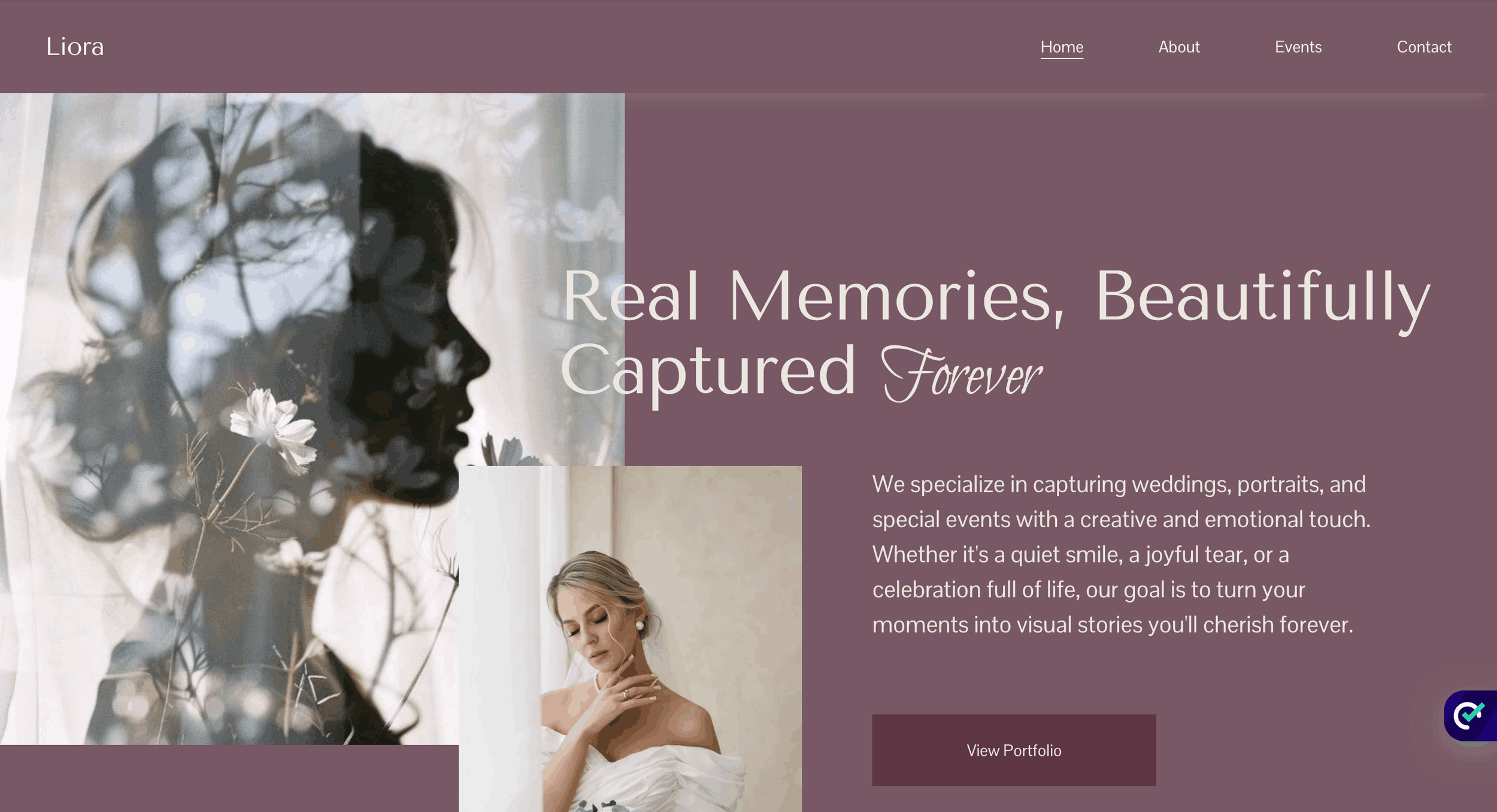
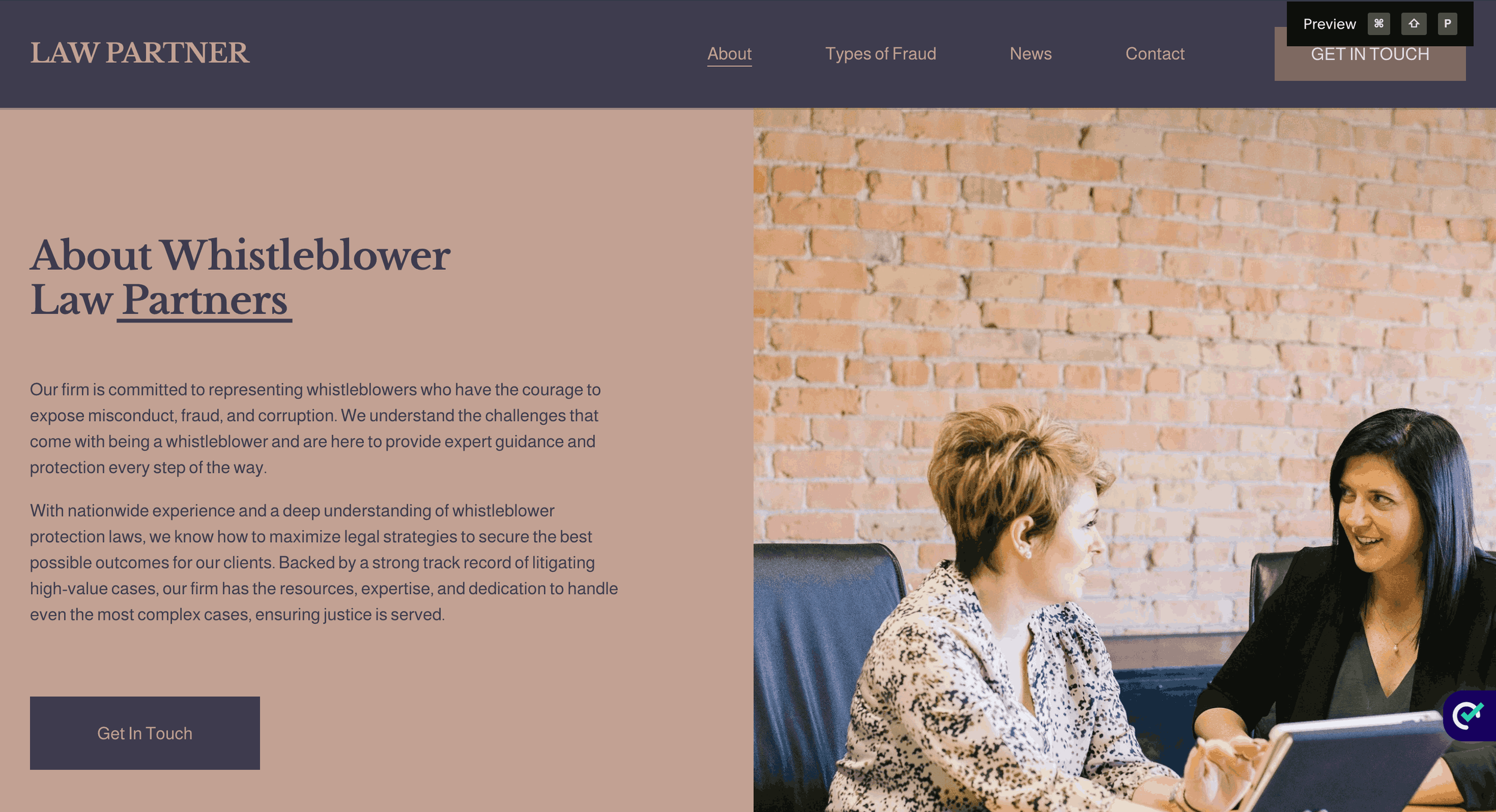
1. Soft Neutrals + Deep Plum
COLOR PALETTE
Hex Codes: #FFFCFC, #BCABB0, #785964, #5D3543, #080808
This palette blends soft neutrals with rich plum tones to create understated elegance. Perfect for fashion, photography, or boutique brands aiming for timeless appeal.
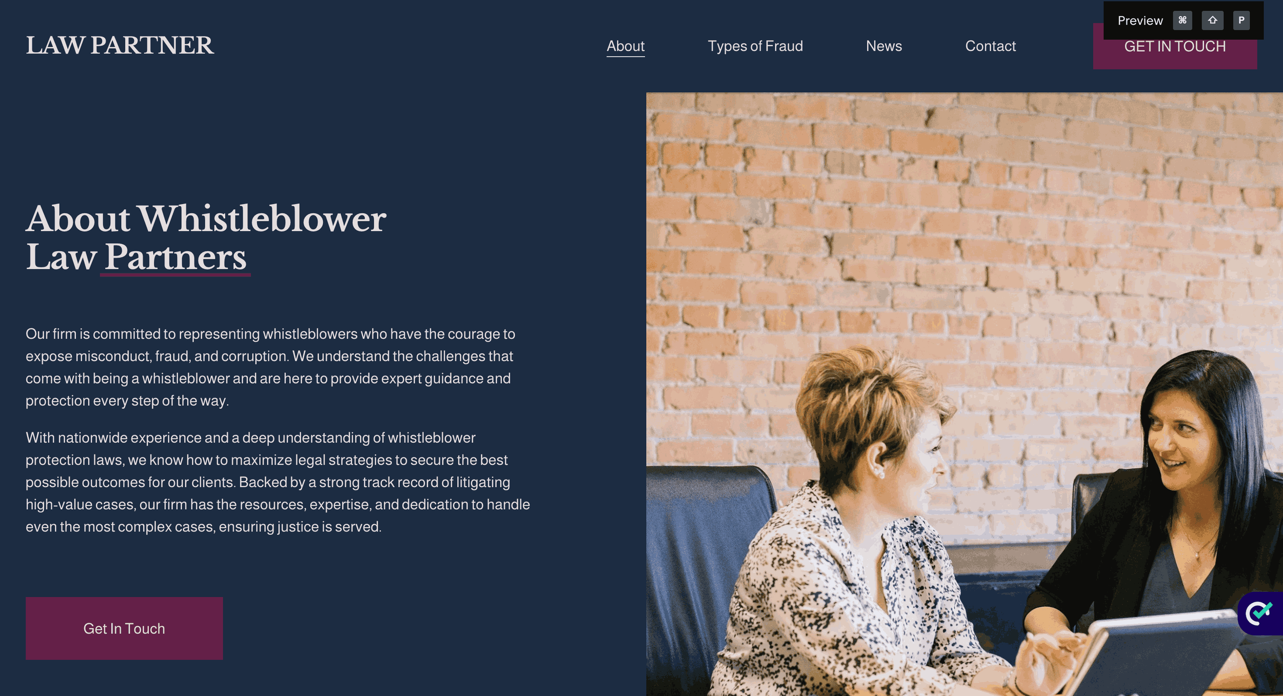
2. Deep Purple + Navy Luxury
COLOR PALETTE
Hex Codes: #FFFCFC, #632148, #1D2C43, #23112F, #040B14
Dark purples and navy tones create mystery and exclusivity , ideal for modern luxury branding colors in tech or high-end services.
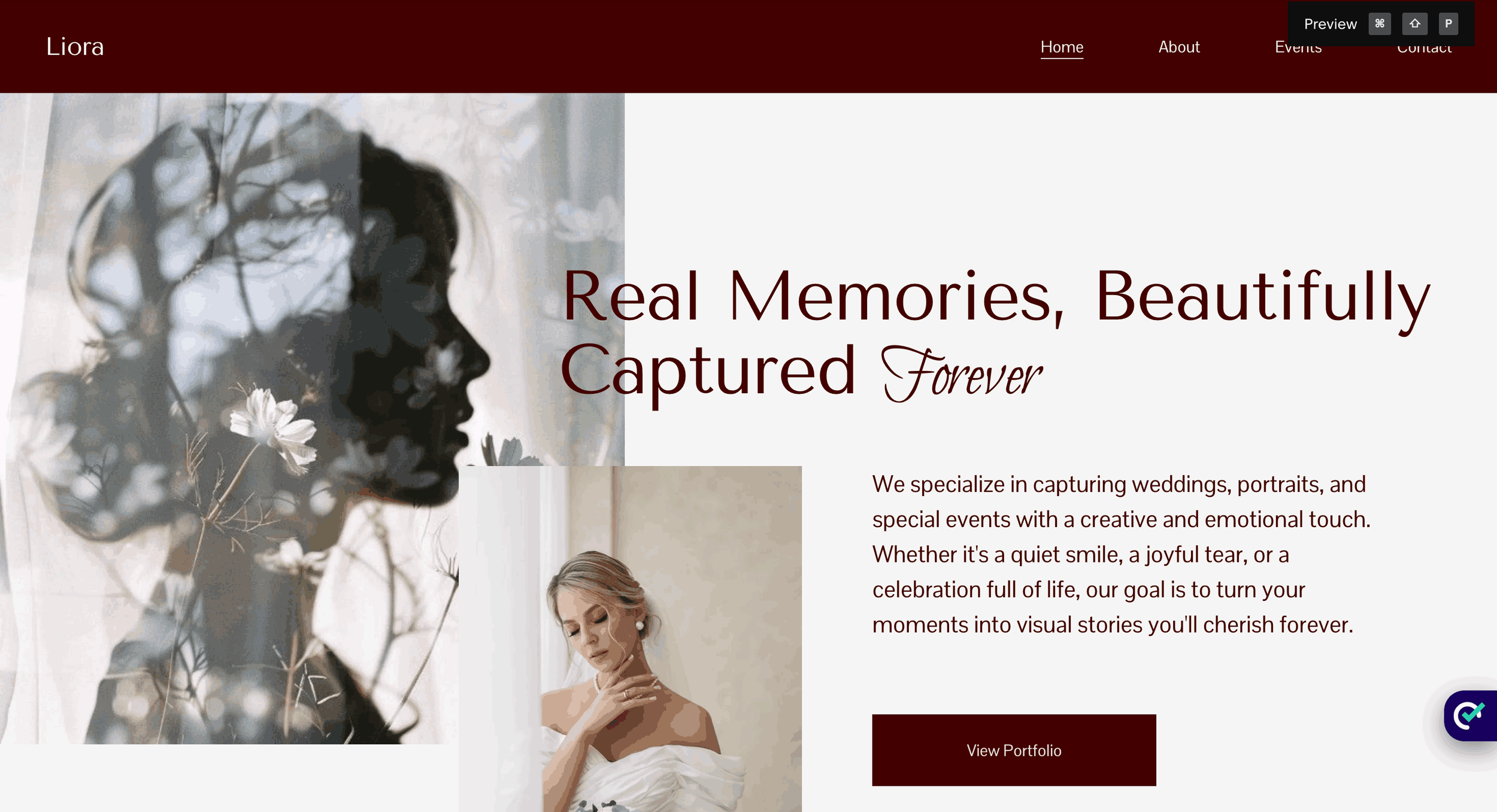
3. Rich Red Statement Palette
COLOR PALETTE
Hex Codes: #FFFCFC, #B77E7E, #650000, #430000, #040B14
Bold yet refined, this palette conveys passion, power, and premium quality , great for luxury retail or hospitality brands.
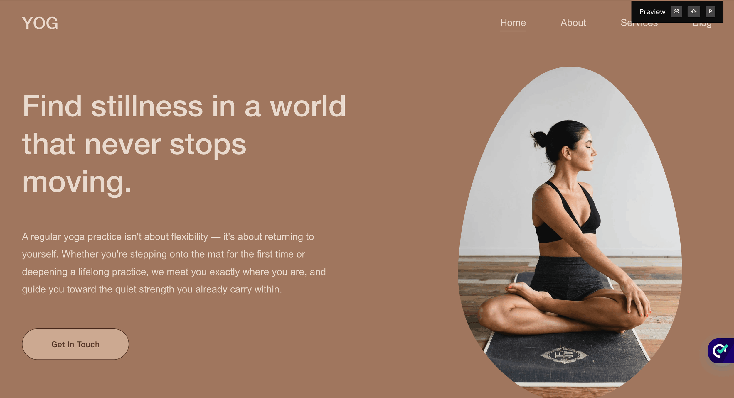
4. Warm Earth Luxury
COLOR PALETTE
Hex Codes: #EADACE, #CDA991, #B2A3A1, #A0765E, #56332B
Soft creams and browns create a grounded, organic feel , perfect for interior design and lifestyle brands.
A carefully selected luxury brand colour palette like this helps communicate warmth and heritage.
5. Cool Blue Elegance
COLOR PALETTE
Hex Codes: #DDE8ED, #447793, #2D5A74, #123249, #061221
Clean, crisp blues evoke trust, confidence, and modern sophistication , ideal for corporate luxury brands.
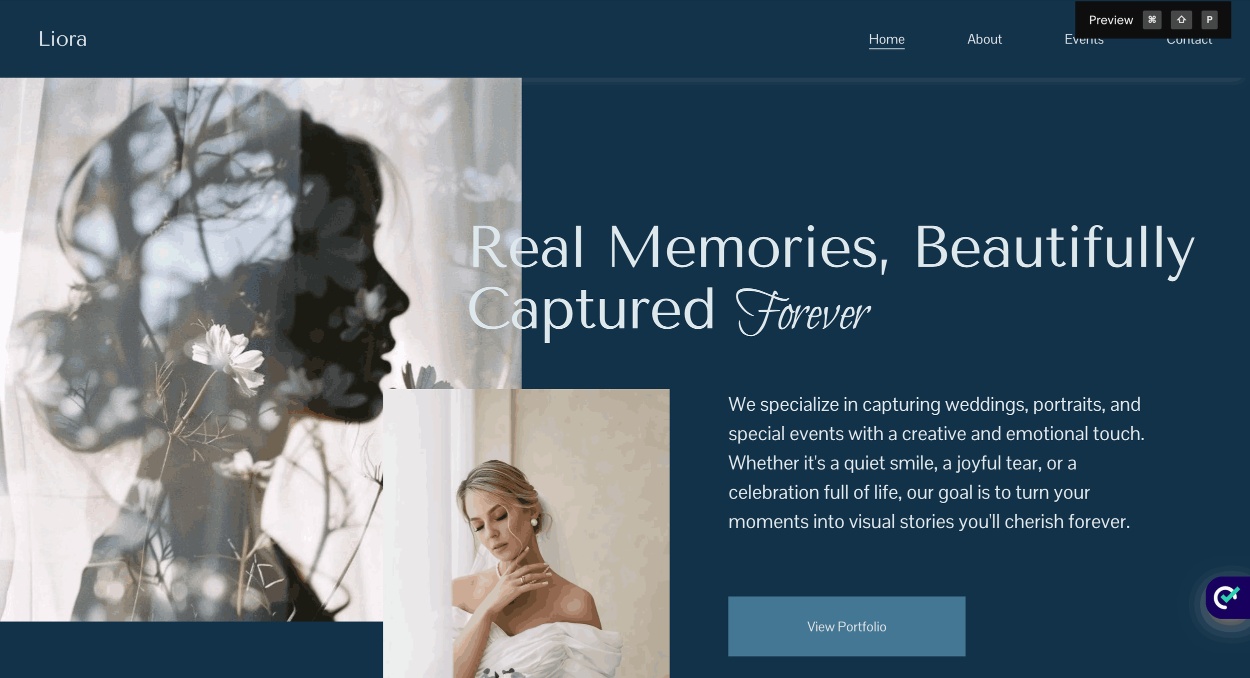
6. Cream + Blue Harmony
COLOR PALETTE
Hex Codes: #DDE8ED, #E6DFC9, #5A8AA6, #2D5A74, #061221
This palette balances warmth and clarity, making it a strong choice for wellness and premium service brands.
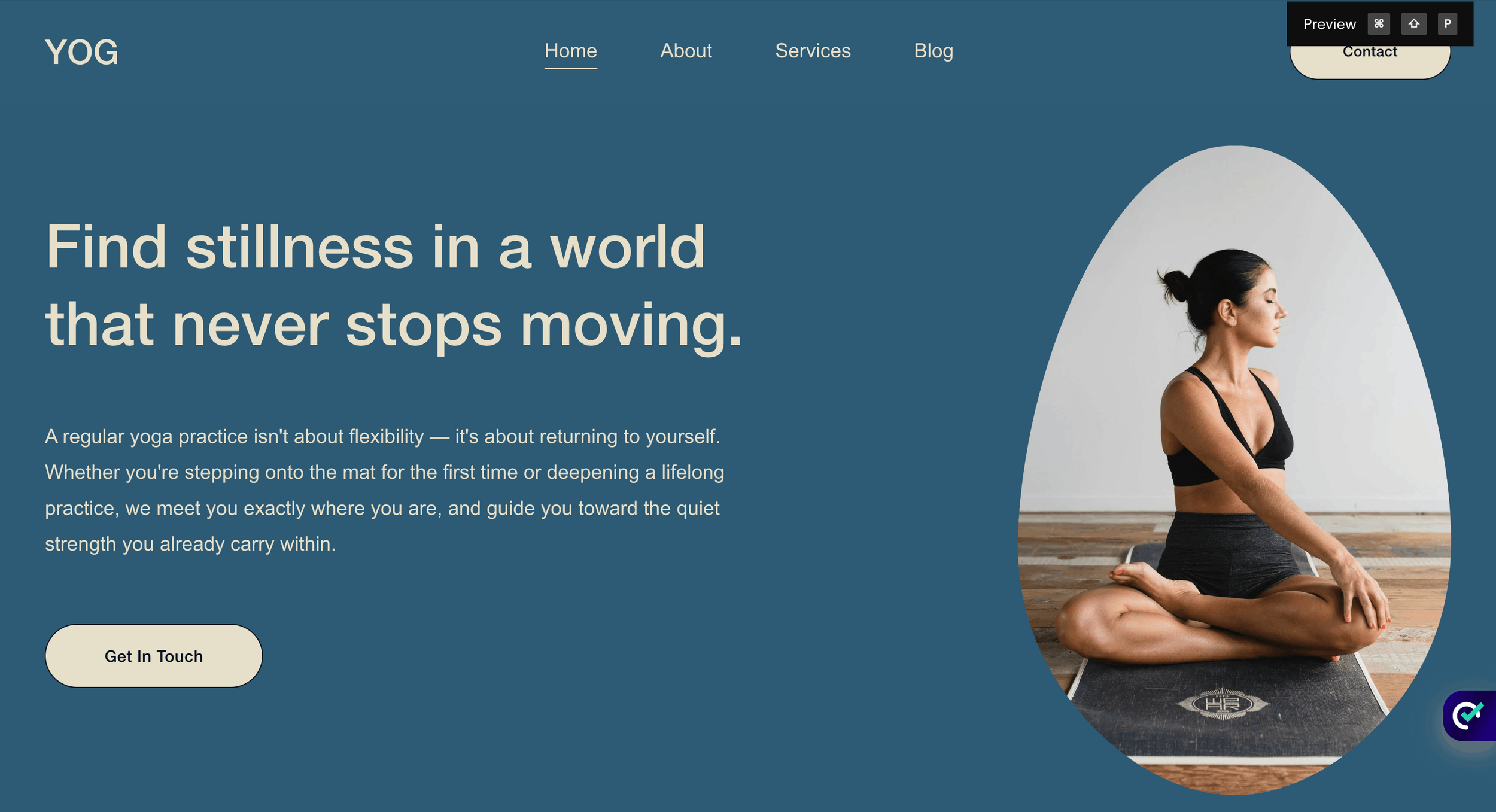
7. Rustic Luxury Blend
Hex Codes: #EDE7DD, #C9BDA1, #624E1F, #803C3C, #2A1F06
COLOR PALETTE
Earthy tones combined with deep red create a sense of tradition and richness , ideal for heritage brands.
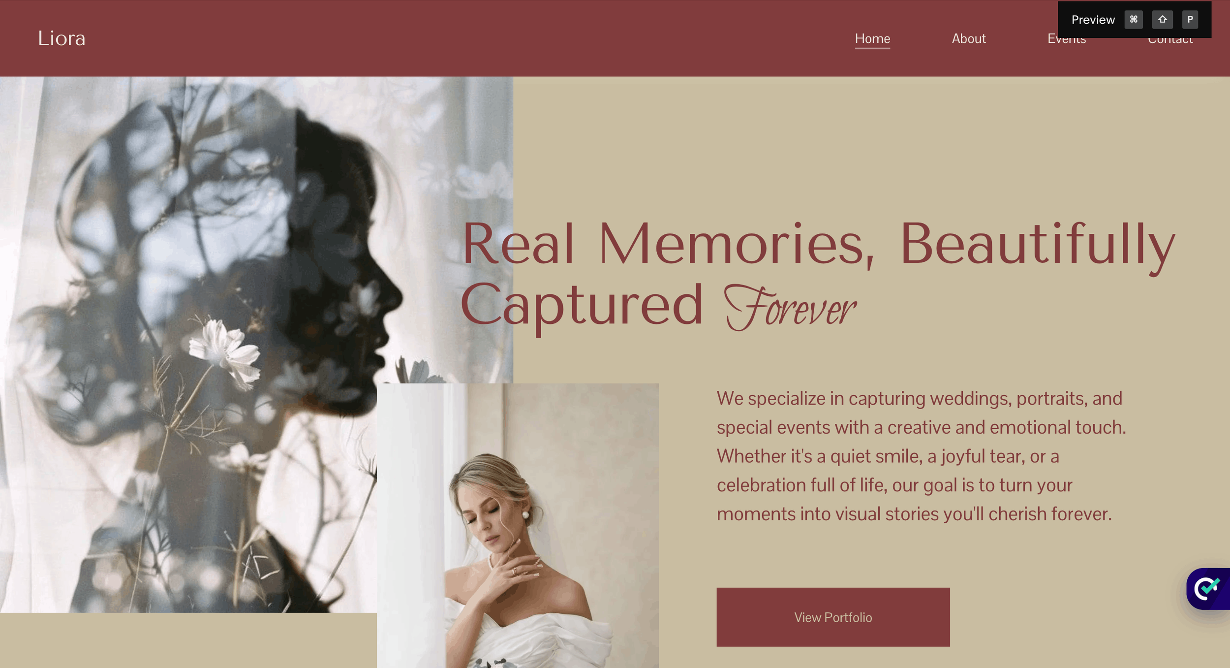
8. Soft Blush & Warm Tones
COLOR PALETTE
Hex Codes: #D1B7B1, #E6A87E, #A08278, #5E555A, #29272F
A gentle, refined palette that feels elegant and approachable , perfect for beauty or personal brands.
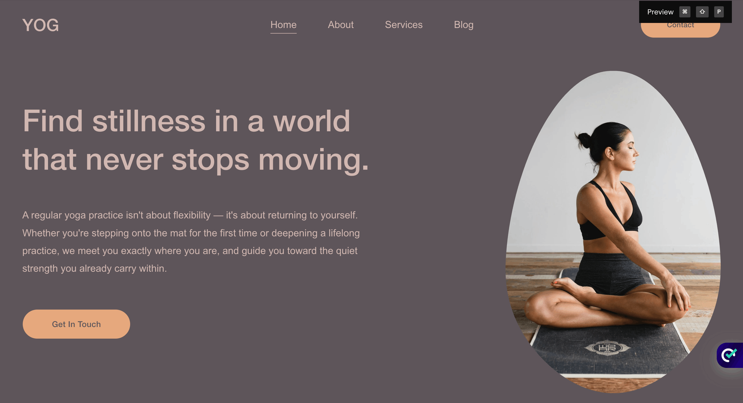
9. Dusty Purple Modern Luxury
COLOR PALETTE
Hex Codes: #C2A093, #7D6662, #756986, #3E3B4E, #292218
This palette blends tradition with a modern edge, making it a standout luxury brand color choice.
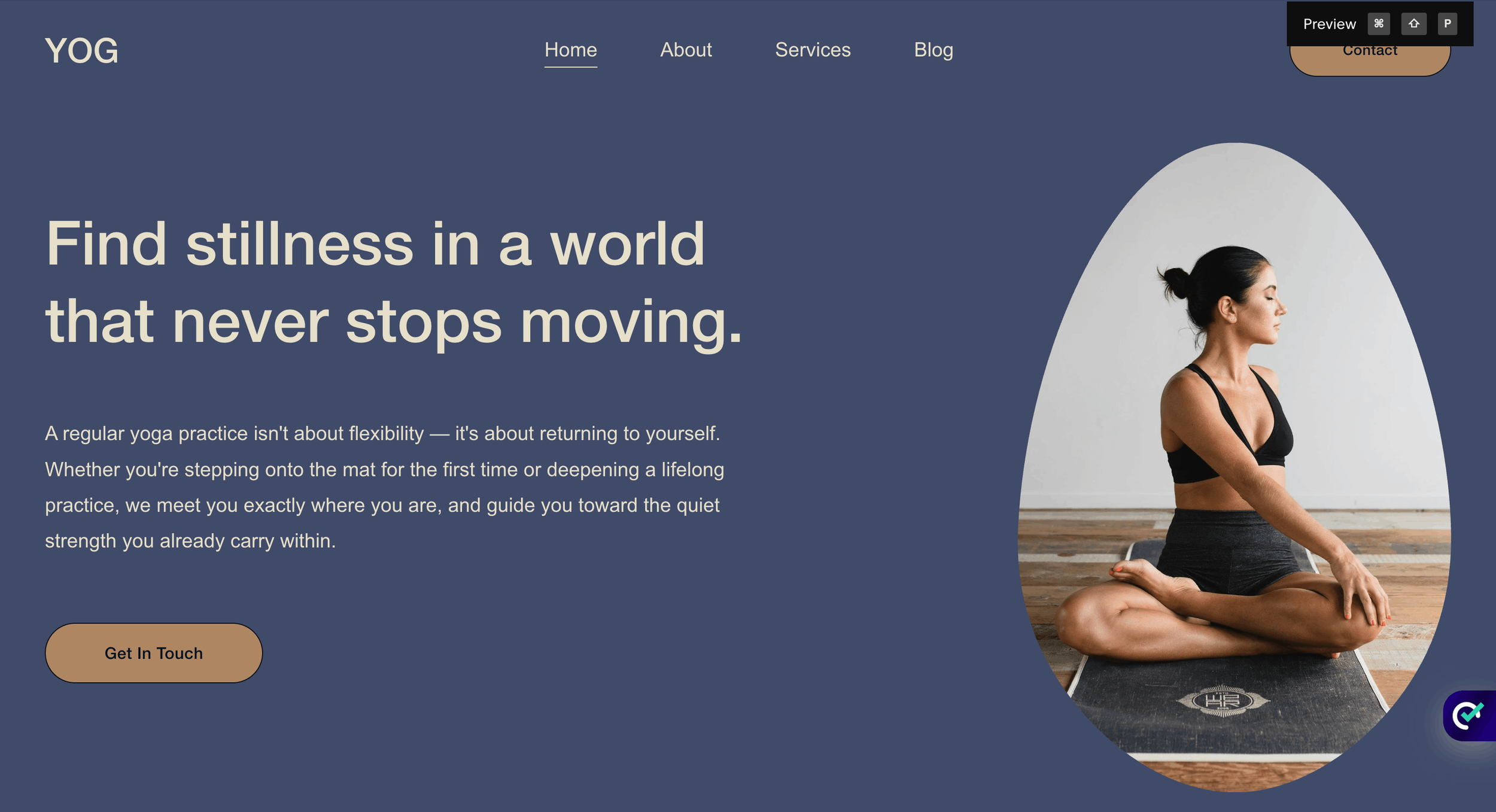
10. Regal Blue & Brown
COLOR PALETTE
Hex Codes: #E6DFC9, #AF8662, #4762AE, #3F4B69, #1D161B
A bold yet balanced palette that communicates confidence and authority , ideal for premium consulting brands.
Each luxury brands color palette above can be adapted for websites, branding, or marketing materials.
How to Choose the Right Luxury Brand Color Palette
Choosing the right luxury brands color palette depends on your brand personality and audience.
Ask Yourself:
Do you want to feel modern or timeless?
Bold or minimal?
Warm or cool?
Quick Tips:
Stick to 3–5 core colors
Use one dominant color + supporting tones
Maintain consistency across your website and branding
A well-defined premium color palette creates a cohesive experience that builds trust and increases conversions.
How Color Impacts Conversions (Why It Matters)
Your color choices directly affect how users feel—and whether they take action.
Dark tones → Authority & exclusivity
Light neutrals → Clean & premium feel
Gold accents → Wealth & prestige
When your luxury branding colors align with your message, users are more likely to:
Stay longer on your site
Trust your brand
Convert into clients
That’s the real power of strategic luxury branding colors.
FAQs About Luxurious Color Palettes
-
Black, gold, navy, deep green, ivory, and muted neutrals are commonly used in luxury colors.
-
Most luxury brands color palette setups use 3–5 colors for a clean, premium look.
-
No. A luxurious color palette can feel premium without gold—contrast and balance matter more.
-
Black + gold, navy + cream, and beige + brown are some of the most effective luxurious color combinations.
Final Thoughts: Build a Brand That Feels Premium
A strong luxury brand color palette is more than just aesthetics , it’s a strategic decision that shapes perception, trust, and value.
If you want your brand or website to feel high-end, intentional, and conversion-focused, your color palette is the best place to start.

Want a High-End Website That Matches Your Brand?
If you're building a premium brand and want a website that reflects it, I can help.
I specialize in designing clean, modern, and conversion-focused Squarespace websites using the right luxury branding colors to elevate your brand.
Let’s create something premium together. Reach out today.
