
How to Change Button Colour in Squarespace in 2026

Your button is in the right place, the wording is clear, but the colour doesn’t quite fit your website. You open the button editor—and the setting you need isn’t where you expected.
To change button colour in Squarespace 7.1, start in Site Styles → Colors, open the colour theme used by the relevant section, and edit its button colour settings. For one button that needs a unique treatment, you can use a Block ID and custom CSS instead.
This guide covers both approaches, along with header button colours, button text, fonts, and hover effects. You’ll also learn how to avoid changing other buttons by accident.
Before You Start: Decide Which Buttons Should Change
First, decide whether you want to update a group of buttons or just one.
For a brand refresh, it makes sense to keep related buttons consistent. For a specific campaign, you might want one call to action to stand out while other buttons retain their existing appearance.
Squarespace separates button types into Primary, Secondary, and Tertiary. Their colours depend on the applicable colour theme. Think of the type as the button’s design role and the theme as its colour context. Squarespace’s button styling guide
A practical approach is to reserve your strongest treatment for the main action, such as “Book a Consultation,” and use a quieter treatment for supporting links, such as “View My Work.” These are design choices, rather than rules you must follow.
This tutorial focuses on Squarespace 7.1. Version 7.0 uses different, template-dependent controls.
How to Change Button Colour Without CSS
1. Check the Button Type and Section Theme
Open the page in the editor. Select the Button Block and check its type in the Design settings. Then check which colour theme its surrounding section uses.
Button Blocks can use different types, while section themes provide different colour schemes. Squarespace’s Button Block guide
Note both settings before making changes. It is easy to edit Primary colours when the button you are looking at uses Secondary styling.

2. Edit the Theme’s Button Colours
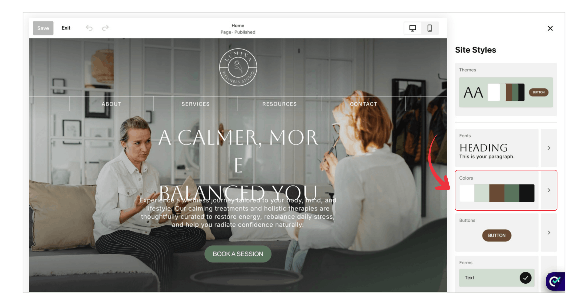
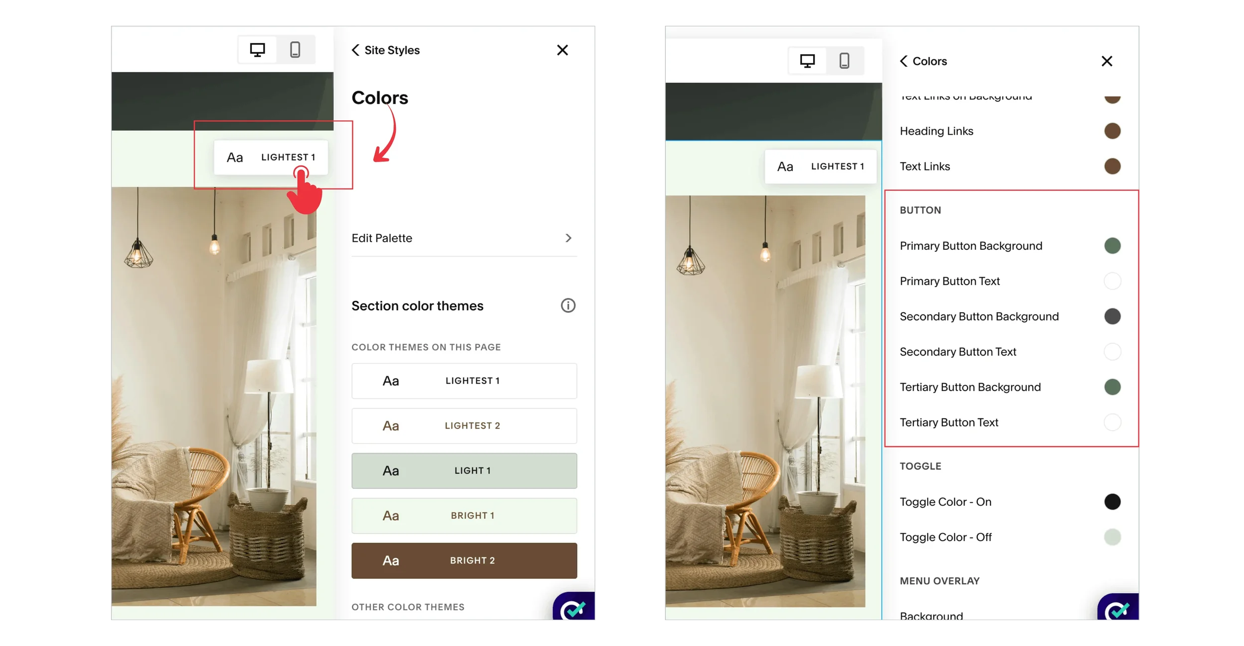
Open Site Styles → Colors, then select the relevant colour theme. Under Button, adjust the background and text colour settings for the type you identified. Save your changes. Squarespace’s colour instructions for buttons
Change the background and text as a pair. A colour that looks attractive on its own may make the label difficult to read.
3. Review Other Sections Using That Theme
A theme edit is shared styling, not a one-button edit. Review other sections using the same theme and button type before considering the update finished.
For example, if your homepage and contact page share a theme, a colour change intended for the homepage may also appear on the contact page. If that is not what you want, use the individual-button method below.
Filled Buttons vs Outline Buttons
A colour setting can look different depending on the button’s treatment. On filled buttons, the background colour fills the shape. For No Fill or Underline treatments, that colour can apply to the outline and text instead. Squarespace’s button colour reference
This is why changing a “background” colour does not always produce a solid rectangle. Check the button’s design before assuming that the colour setting has failed.
Choose the treatment based on emphasis. A filled button can suit the main action, while an outline can give a supporting action less visual weight.
How to Change the Colour of One Squarespace Button
For a unique button colour, target the clickable button inside its Block ID. This keeps the change separate from shared theme colours.
Use a Squarespace ID Finder to copy the Button Block’s ID. Then open the Custom CSS panel and add:
/* One standard Button Block */
#block-YOUR-ID .sqs-block-button-element {
  background-color: #245c45 !important;
  color: #ffffff !important;
  border-color: #245c45 !important;
}
Replace #block-YOUR-ID with the actual ID, keeping one # at the beginning. Save the CSS and preview the page. Squarespace explains the editor workflow in its Custom CSS guide.
This example gives the button a dark green background and white text. border-color recolours an existing border; it does not create a border where none exists.
Use a standard filled Button Block as the starting point. Outline, underline, or heavily customised button designs may need additional adjustments.
The .sqs-block-button-element part is important: it targets the button inside the block. Styling only the outer Block ID may colour the surrounding block area instead.
The declarations use !important to help override normal theme declarations. That does not fix a wrong selector or guarantee that every competing custom rule will be overridden.
How to Change the Button Font in Squarespace
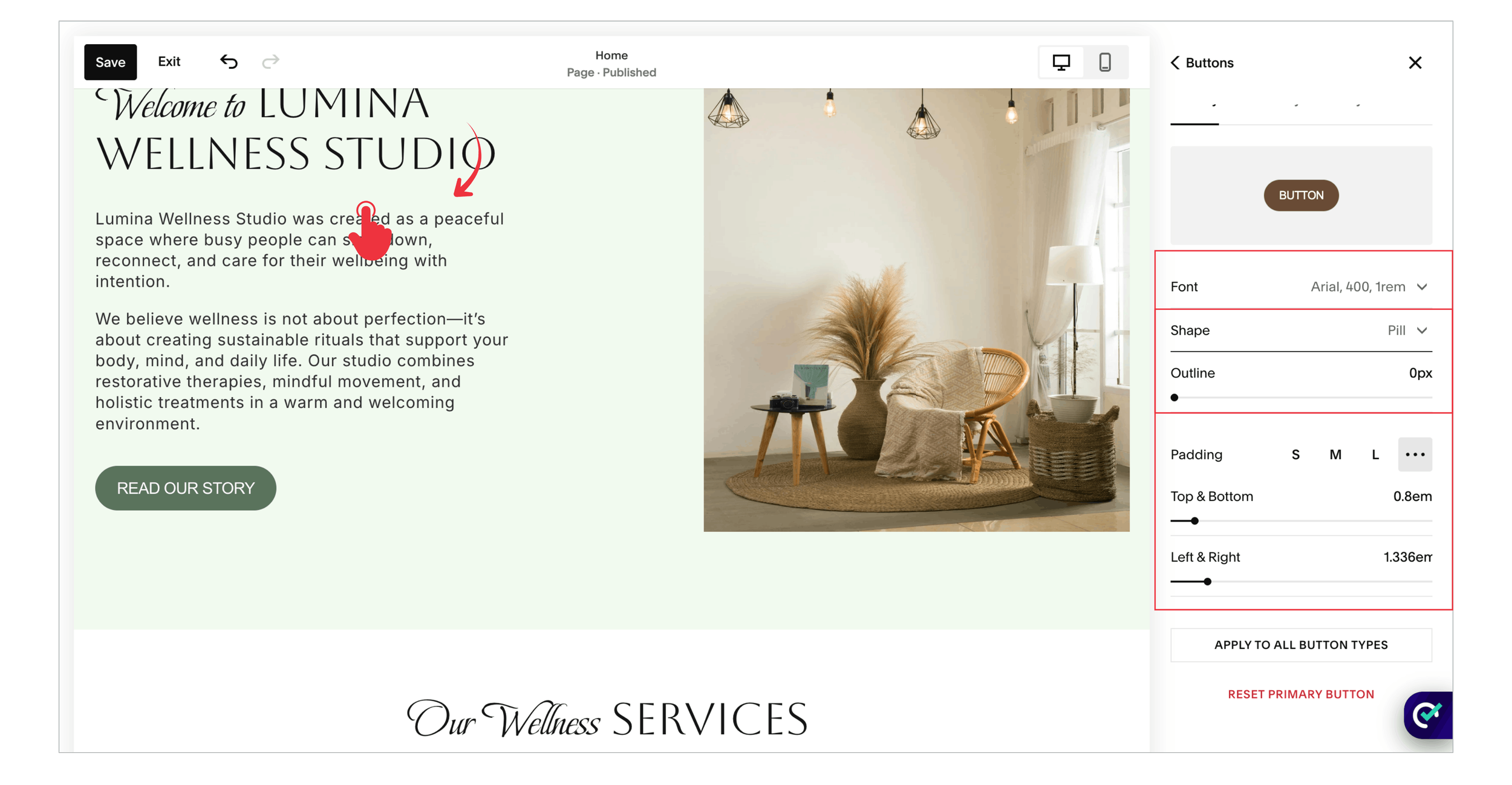
To customise a button font, open Site Styles → Fonts → Buttons and select the relevant button type. Adjust the font family, weight, size, letter spacing, and other available text settings. These changes are shared by buttons following that style. Squarespace’s font guide
For a Primary header button, Squarespace provides a separate font setting under Fonts → Assign Styles → Header Button. Secondary and Tertiary header buttons follow their respective button styles. Squarespace’s header font guidance
Start with a font that complements your website’s existing typography. A button does not need an unusual typeface to stand out; readable text, sufficient space, and a clear label often do more useful work.
After changing the font, review your longest label on mobile. Increased letter spacing or a heavier font may make a previously comfortable button feel crowded.
How to Change Button Hover Colour With CSS
For a specific hover colour on one standard Button Block, add this below the single-button CSS shown earlier. Replace the placeholder ID in both selectors:
/* Hover and keyboard focus colours */
#block-YOUR-ID .sqs-block-button-element:hover,
#block-YOUR-ID .sqs-block-button-element:focus-visible {
  background-color: #173f30 !important;
  color: #ffffff !important;
  border-color: #173f30 !important;
  opacity: 1 !important;
}
The button becomes a deeper green while keeping white text. The opacity declaration prevents a simple opacity fade from diluting these colours when this rule wins the cascade.
The :focus-visible selector provides the same colour treatment during relevant keyboard focus. Keep the existing focus outline visible; the code does not remove it.
If you want a gradual colour change, add this optional rule using the same ID:
#block-YOUR-ID .sqs-block-button-element
{ transition: background-color 0.2s ease,
color 0.2s ease,
border-color 0.2s ease; }
This changes colour only. It does not add zooming, movement, or a new click action.
On touchscreens, hover can behave differently or fail to appear. Make sure the normal button state remains clear and usable without hovering. MDN’s hover reference
Why Isn’t My Button Colour Changing?
1. You Edited a Different Theme or Button Type
Return to the actual button and check its settings. Troubleshooting is easier when you know the type and theme before changing more values.
2. Existing CSS Overrides the Theme
If someone previously customised your site, a rule may already set the button background with !important. Review that rule before adding another override. Several competing snippets make future updates harder to understand.
3. The Button Belongs to Another Component
A newsletter submission button, store button, and header button are not interchangeable with a standard Button Block. The Block ID examples in this guide are deliberately limited to standard Button Blocks.
4. The Button Uses an Outline or Decorative Effect
Check the underlying design and any custom hover effects. A background image or an overlay can sit over the colour you are changing. Adding more colour declarations may not address that layer.
5. Check the Result Before You Finish
Open the published page outside the editor and test the button with a mouse, keyboard, and phone. Check the normal and hover states, confirm that the label is readable, and follow the link to its destination.
For a business website, review the button in context. Does it stand out enough from the section? Is it obvious what happens after clicking? Are several equally prominent buttons competing for attention?
There is no universal “best converting” button colour. A sensible starting point is a colour that fits your brand, contrasts clearly with its surroundings, and creates a consistent cue for the main action.
Frequently Asked Questions
-
Yes. Use the built-in theme settings for shared button colours. CSS is useful when you want a particular button to look different from others using the same styling, or when you need a custom hover treatment. Start with the built-in controls if they meet your needs.
-
You probably edited a shared setting. Review where the same theme and button type are used. If the change was meant for one campaign button only, restore the shared colours and apply a targeted Block ID rule to that button instead.
-
For a filled button, adjust its text colour alongside the background setting, or use the color declaration in the CSS example. Always preview the combination. Changing only the background can leave the existing label with poor contrast, especially when switching from a light colour to a dark one.
-
Remove the CSS rules you added for that button and save. If you changed theme settings, restore those colours separately. Keep unrelated CSS in place, then check the normal and hover states to confirm that the button has returned to the intended design.
My Final Thoughts
Changing a button colour is a small task, but it works best as part of a clear page design. Pair the colour with a readable label, give the button enough space, and make sure its destination matches what you promise.
Use shared settings for consistency and targeted CSS where you need a specific exception. That keeps your website easier to manage as it grows.
Building or improving a Squarespace website? A polished design is all about getting the details right. Book a free call with me to discuss your website, your goals, and how I can help turn your ideas into a professional Squarespace website designed to convert visitors into enquiries.
