
Squarespace Mobile Optimization: How to Fix Mobile View Issues

Your homepage might look exactly right on a laptop. Open it on your phone, though, and the heading takes up most of the screen, the image crops out the subject, and the contact button sits much further down than you expected.
These are the details that make mobile website optimization worth your attention. Visitors should be able to understand your services, read your content, and contact you comfortably from a smaller screen.
In this guide, you’ll learn how to review your Squarespace mobile layout, fix common problems, and check whether the finished page works for someone trying to make an enquiry or book your services.
What Is Mobile Website Optimization?
Mobile website optimization means improving how your website looks, loads, and works on phones. It includes readable text, sensible image crops, accessible navigation, and buttons that are easy to tap.
A page can fit the screen and still be difficult to use. Perhaps the menu opens correctly, but the booking link is hard to find. Or the layout looks tidy, but a large video makes the first section slow to appear.
Good mobile site optimization considers the whole experience, from arriving on the page to completing the next step.
Why Mobile Optimization Matters for Your Squarespace Website
Someone visiting your site between appointments may have a very specific question: What do you offer, does it suit their needs, and how can they get in touch?
A clear mobile layout helps them answer those questions without pinching to read text or searching through a crowded menu.
There is also an SEO consideration. Google uses the mobile version of a site’s content for indexing and ranking. Keep your important service information, headings, and supporting content available on mobile instead of removing them simply to shorten the page. Google’s mobile-first indexing guidance explains this approach.
Improving mobile usability supports a better website experience. It does not guarantee a first-page Google ranking.
Before You Start: Know Which Edits Affect Desktop
This walkthrough focuses on Squarespace 7.1 pages with Fluid Engine sections.
In Fluid Engine, you can arrange and resize blocks in the mobile layout independently. However, editing shared content, such as paragraph text or a button’s destination, changes it on both layouts. Only certain blocks offer separate mobile design settings. See Squarespace’s mobile layout guide for the current controls.
Keep that distinction in mind when making adjustments. A layout fix and a content edit are different actions.
If your page uses another editor or section type, its controls may differ. Check the options available for that section before following Fluid Engine-specific instructions.
1. Review the Page in Mobile View
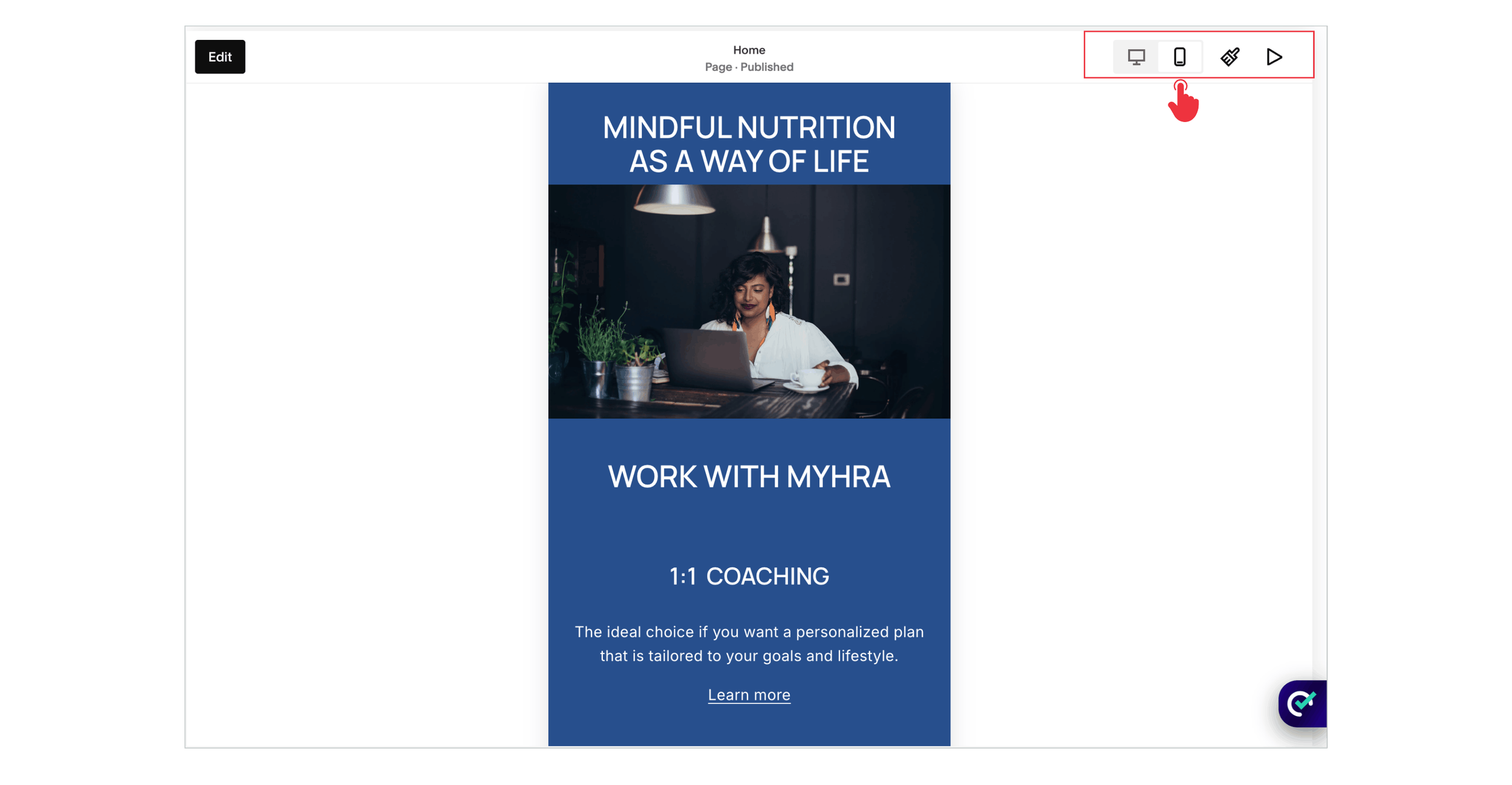
Open Pages, choose your page, click Edit, and select the Mobile View icon. Start with the homepage, then work through your main service pages and contact page.
Scroll through the full page before changing anything. Note the biggest obstacles: an obscured button, a heading that dominates the screen, or an image separated from the text it belongs with.
Prioritize anything that prevents a visitor from understanding your offer or taking action. Slightly uneven spacing can wait until your main enquiry route works properly.
2. Put Content in a Useful Reading Order
A desktop section may spread text and images across several columns. On a phone, those elements need to make sense as a sequence.
For a service introduction, a useful order might be the heading, a short explanation, a relevant image, and a booking button. The right order depends on what the reader needs to understand before deciding to act.
Move misplaced blocks in the mobile layout so related content stays together. For example, keep a testimonial next to its attribution rather than allowing another image to separate them.
Read the section from top to bottom after rearranging it. Does each element naturally lead to the next?
3. Fix Overlapping Blocks and Excessive Gaps
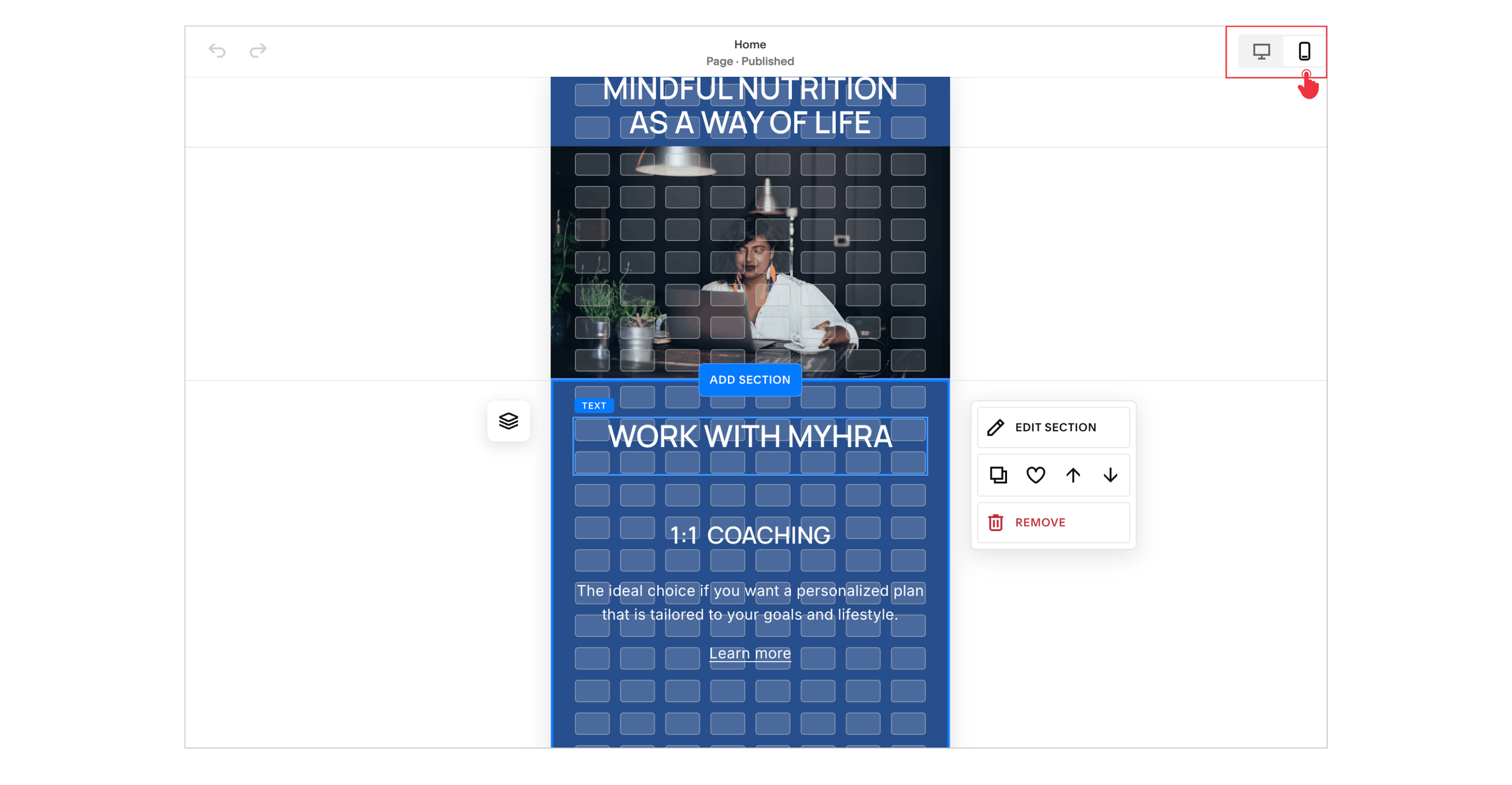
Overlapping text can make a page difficult to read, while large empty spaces can make related information feel disconnected.
Check the space occupied by each block, not just the visible text or image inside it. A block may extend further than you expect. In Fluid Engine, adjust its position and size, then review the section’s grid height if unnecessary space remains underneath.
Aim for a clear rhythm: a smaller gap between a heading and its paragraph, and a larger gap before a new topic.
Avoid solving every gap by squeezing everything together. The page still needs breathing room, especially around buttons and forms.
4. Make Headings and Paragraphs Comfortable to Read
A dramatic desktop heading can become six short lines on a narrow screen. Before reducing its font size, check whether the text block is unnecessarily narrow or contains manual line breaks.
Widen the block where appropriate and review the wording. If you change the actual heading text, remember that you are editing shared content.
For paragraphs, aim for comfortable reading without zooming. Break up long passages where the subject changes, and make sure text remains readable against its background.
Where a mobile-specific style control is available, use it for a targeted adjustment. Recheck desktop whenever you change a shared style.
5. Check Image Crops and Backgrounds
A photo can look balanced in a wide desktop section but lose its subject when displayed in a narrower frame.
Review portraits, product photos, and hero images individually. If the focal subject is cut off, check the available crop, focal point, or image display controls. Consider whether a different image would work more reliably across screen shapes.
Text placed over photography needs extra attention. A crop change can put a heading over a busy or bright part of the image. If readability varies, consider moving the text onto a solid background.
Keep important wording as page text rather than embedding it only inside a graphic that becomes tiny on a phone.
6. Test the Menu and Every Important Button
Open the published website on your phone and use the menu as a new visitor would.
Can you quickly find services, pricing information where available, and the contact page? Does the menu close properly? Are any links hidden beneath a banner or another interface element?
Check buttons in context. A “Book a Call” button should look distinct, have space around it, and lead to the intended booking page.
Do not rely on hover effects to reveal essential information. A touchscreen visitor should be able to understand and use the page without moving a mouse over an image or navigation link.
7. Complete Your Contact or Booking Process
A mobile review is incomplete until you test the action you want visitors to take.
Submit a test enquiry and confirm that it reaches the correct destination. Check the confirmation message, required fields, and any validation errors. If you use an embedded scheduler, complete the booking steps far enough to confirm they fit and remain usable on the screen.
Ask only for information you need at this stage. A long form may be appropriate for a detailed project application, but a simple initial enquiry rarely needs the same level of detail.
Also check whether a popup, cookie banner, or chat widget covers the submit button.
8. Check Mobile Loading Performance
Layout and speed are separate parts of website optimization for mobile. A tidy page may still take too long to become useful.
Start with your busiest or most important pages. Review large visuals, background videos, and third-party embeds. Consider whether each element helps the visitor enough to justify its place on the page.
Use an appropriately sized, compressed image that still looks sharp. Avoid adding several heavy interactive widgets when a simpler presentation would meet the same need.
Before removing an integration, check what it does. A booking system or necessary analytics setup deserves a more considered decision than an unused decorative widget.

Need Help with Your Squarespace Website?
Book a free kick-off call to discuss your project requirements in detail. Whether you're launching a new Squarespace website, redesigning an existing one, or looking to improve functionality and user experience, we'll help you explore the best options for your goals.
Which Mobile Optimization Tool Should You Use?
PageSpeed Insights is a useful starting point. Enter a page URL and review its mobile results. It provides simulated lab testing and, when sufficient data is available, real-user performance information.
Lab results help investigate problems now. Real-user data reflects a rolling 28-day period, so it will not immediately show the full effect of today’s changes. A lack of field data does not automatically mean the page is performing badly. Google explains how PageSpeed Insights data works here.
Treat a mobile optimization checker as one part of your review. A score cannot tell you whether your service explanation is clear or whether your enquiry form asks sensible questions. You still need to use the website yourself.
9. Save, Test on a Phone, and Recheck Desktop
After saving, open the page outside the editor. Try more than one screen size where possible and test a second browser if something behaves unexpectedly.
Follow one complete journey: arrive on a service page, read the details, open the menu, and send an enquiry. Check both portrait and landscape orientation for obvious problems.
Then return to desktop and confirm that shared content or style changes have not introduced a new issue.
Repeat this review after adding a new section, changing a headline, or installing an integration. Mobile optimization is part of maintaining the website, not just a launch-day task.
Squarespace Mobile Troubleshooting Checklist
Use this table to decide where to start when something looks wrong.
| What You Notice | What to Check First | What a Successful Fix Looks Like |
|---|---|---|
| Text overlaps another element | Block positions and occupied space | Content remains readable without collisions |
| A large blank gap appears | Block dimensions and section grid height | Related information stays visually connected |
| A heading fills most of the screen | Block width, line breaks, and available typography controls | The heading introduces the section without dominating it |
| A photo loses its subject | Crop, focal point, and display options | The important part of the image stays visible |
| A button is hard to tap | Surrounding space and overlapping elements | The intended link opens comfortably |
| The form looks fine but enquiries fail | Submission settings and the full visitor journey | The message arrives and confirmation appears |
| The page loads slowly | Performance report, media, and embedded tools | The page becomes useful sooner in repeat testing |
My Final Thoughts
A well-designed mobile website makes everyday actions feel straightforward. Visitors can read your offer, explore the information they need, and contact you without fighting the layout.
Start with the pages that matter most to your business. Resolve the obstacles to enquiries first, then refine the spacing, images, and visual details that make the experience feel consistent.
Building or improving a Squarespace website? Book a free call with me to discuss your website, goals, and how I can help create a professional Squarespace website that is easy to use across screen sizes.
