
Squarespace Image Hover Text: Create a List Section Flip Effect
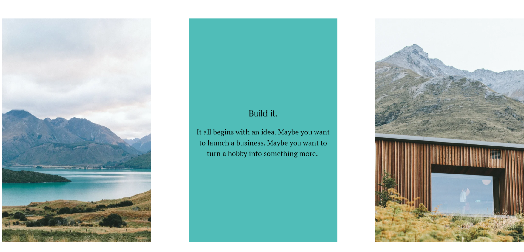
Want to reveal a title, description, or call to action when someone hovers over an image? A Squarespace image hover text effect can turn a simple row of images into interactive cards.
This approach works well for short service introductions, project summaries, or team profiles. The image introduces the subject, and the text gives visitors a little more context when they interact with the card.
In this tutorial, you’ll learn how to create a flip-style reveal for a simple List section in Squarespace 7.1 using custom CSS. On supported desktop devices, the image rotates and fades as the text appears. On touchscreens, the section keeps its ordinary visible image-and-text layout.
What Is a Squarespace Image Hover Text Effect?
An image hover text effect reveals written content when a visitor moves their pointer over an image. It can be a subtle caption overlay, a fade, or a more noticeable flip animation.
The version below replaces the image visually with a colored text panel. It is intended for a simple List section, rather than a gallery or an individual image block.
Squarespace calls these sections auto layouts and supports arrangements including rows, columns, and carousels. Choose a basic list layout for this tutorial. See Squarespace’s auto layout guide.
Step 1: Prepare Your List Section
Open the page you want to edit and add a List section, or use an existing simple list. Replace the placeholder images and edit each item’s title and description.
Keep the content concise. A service card might have a heading such as “Website Redesign,” followed by one sentence explaining who the service helps.
Before adding the CSS:
Use a simple layout with the image above the text.
Keep titles and descriptions enabled and visible in the section settings.
Add a real, relevant button or text link to each card you want to animate.
That final point matters for keyboard access. A link such as “Explore Website Redesign” gives visitors a way to focus the card and reveal its text without a mouse. Do not add empty links just to trigger the animation.
Step 2: Find Your Section ID
The effect should apply only to the section you choose. Using broad selectors such as .list-item-content alone could affect other lists on your website.
In your desktop browser, right-click an item in the target section and choose Inspect. In the Elements panel, move up to its containing <section> element and locate the data-section-id attribute.
Copy the value inside its quotation marks. You will replace every instance of YOUR-SECTION-ID in the snippet with that value.
This step is easiest if you’re comfortable with browser inspection. If you can’t identify the correct section, get help before applying the CSS across your site.
Step 3: Add the Custom CSS
Back up your existing custom CSS and remove any earlier version of this hover effect. Open the Custom CSS panel and paste the following snippet outside any existing rule.
Replace YOUR-SECTION-ID throughout, then save. Paste the CSS only, without HTML <style> tags. Squarespace explains the panel and saving process in its Custom CSS guide.
Want to reveal a title, description, or call to action when someone hovers over an image? A Squarespace image hover text effect can turn a simple row of images into interactive cards.
This approach works well for short service introductions, project summaries, or team profiles. The image introduces the subject, and the text gives visitors a little more context when they interact with the card.
@media only screen and (min-width: 640px) {
section[data-section-id="6a9cfd3343bc6a532c7b967a"] .list-item-content {
transform: rotateY(180deg);
transition: all 1s;
margin-top: -100%;
padding-bottom: 30% !important;
padding: 1rem;
opacity: 0;
}
.list-item:hover .list-item-content {
transition: all 1s;
transform: rotateY(0deg);
opacity: 1;
}
.list-item-media img {
transform: rotateY(0deg);
transition: all 1s;
}
.list-item:hover .list-item-media img {
transition: all 1s;
transform: rotateY(180deg);
opacity: 0;
}
.list-item:hover .list-item-media {
transition: all 1s;
transform: rotateY(180deg);
background-color: #c4dbc8;
}
}
In this tutorial, you’ll learn how to create a flip-style reveal for a simple List section in Squarespace 7.1 using custom CSS. On supported desktop devices, the image rotates and fades as the text appears. On touchscreens, the section keeps its ordinary visible image-and-text layout.
Compatibility note: This is an implementation starting point for List items whose media and content containers are direct children of .list-item. It has not been tested on your live Squarespace site. Different layouts, existing customizations, or changed platform markup may require adjustments.
The snippet uses :has() to animate only cards containing a content link. Cards without one retain their normal layout; browsers that do not support that selector also keep the ordinary layout.
Step 4: Customize the Colors and Animation
Start with the default effect, then make small adjustments to suit your brand.
| Setting | Default | What It Controls |
|---|---|---|
| Panel background | #50bdb8 | The turquoise background behind the revealed content |
| Base text color | #111111 | The inherited text color; separately styled headings and links may need adjustment |
| Content padding | 1.5rem | Space between the content and the panel edges |
| Transition duration | 0.5s | How quickly the flip and fade take place |
Check your section’s heading, paragraph, and button colors against the new background. Existing Squarespace styles can override inherited text color, so changing one value may not recolor every element.
For a calmer effect, keep the transition brief and the copy short. Avoid putting an entire service description inside a small card. Let the card introduce the topic and link to a page with the full explanation.
Step 5: Understand Desktop and Mobile Behavior
A touchscreen does not have the same hover interaction as a mouse. Changing a breakpoint from 640px to 40px only changes which screen widths receive the CSS; it does not create dependable touch interaction.
The snippet checks screen width, hover support, and pointer precision. The hover media feature tests whether the primary input mechanism can hover. MDN explains the hover media feature here.
On devices that don’t meet those conditions, the snippet leaves the original image-and-text layout in place. Visitors can read the content without needing to discover a tap gesture.
For keyboard users, :focus-within reveals the panel when a link inside the card receives focus. See MDN’s focus-within reference. This is why each animated card needs a meaningful link.
Step 6: Test Before Publishing
Check the section outside the Squarespace editor. Hover over each card, then use the Tab key to move through its links.
Review three things:
Readability: Titles, descriptions, and buttons remain readable, including on the longest card.
Interaction: Hover and keyboard focus reveal the text, and links lead to the intended pages.
Responsive layout: Text stays visible on touchscreens, with no clipped content at smaller widths or increased browser zoom.
The reduced-motion rule removes the rotation and transition for visitors who request less motion. Check that version too, especially if you add your own animation rules later.

Need Help with Your Squarespace Website?
Book a free kick-off call to discuss your project requirements in detail. Whether you're launching a new Squarespace website, redesigning an existing one, or looking to improve functionality and user experience, we'll help you explore the best options for your goals.
Frequently Asked Questions
-
Yes, if you want the text to stay visible. In a Fluid Engine section, you can arrange a text block over or beside an image block. Built-in hover options depend on the editing system and block type; Fluid Engine image blocks do not offer the same built-in caption hover settings as some older image blocks. See Squarespace’s image hover guide.
-
No. This snippet targets a particular List section structure. Gallery sections, image blocks, and carousel layouts may use different markup or positioning. Use the simple list setup described above, and avoid pasting the code into a different layout with the expectation that it will behave identically.
-
First, check that you replaced every section ID placeholder and removed the earlier snippet. Confirm that the card has a real link inside its content and that you’re testing with a suitable pointer on a viewport at least 640px wide. If those conditions are met, inspect whether your List section uses the expected media and content containers.
-
A tap-to-flip experience needs a deliberate touch interaction design. This tutorial keeps the text visible on touchscreens so people can read it immediately. If you want tapping to toggle a card, you’ll need a different implementation that defines how users open it, close it, and activate any links inside it.
Final Thoughts
An image hover effect can add interest to a service section or portfolio grid, but its purpose should remain clear. Use it to introduce useful information, keep the animation subtle, and make sure the content is easy to reach with a mouse, keyboard, or touchscreen.
For most professional websites, a few thoughtfully designed interactions are enough. Consistent images, readable text, and meaningful links will help the effect feel like part of your website rather than an isolated decoration.
Building or improving a Squarespace website? Book a free call with me to discuss your website, goals, and the improvements you have in mind. Whether you need a few custom design touches or a complete redesign, I can help you create a professional Squarespace website that reflects your brand and encourages visitors to take action.
