
10 Best Church Websites of 2026
Your church website is often someone’s first interaction with your ministry. Before they attend a Sunday service, hear a sermon or meet anyone from your team , they visit your website.
And in just a few seconds, they’re asking:
Does this feel welcoming?
Can I find what I need quickly?
Would I feel comfortable visiting this church?
That’s why strong church websites matter more than ever.
Whether someone is checking service times, watching sermons online, exploring kids ministry, or visiting for the first time, your website becomes your church’s digital front door.
In this guide, we’re sharing 10 excellent church sites in 2026 that stand out for more than just great design.
They’re thoughtful, easy to use, and built to help people take the next step.
If you're looking through church site samples, planning on creating church websites, or searching for ideas for your own ministry website design, this list will give you practical inspiration you can actually use.
What Makes Great Church Websites?
A great website isn’t just about looking good , it should make visitors feel welcome and help them find what they need quickly.
The best church websites usually do a few things really well: clear service times, easy navigation, mobile-friendly design, authentic photography, and a simple path for first-time visitors to plan their visit. And around 60%+ of church website visitors come from mobile devices, so mobile-first design is no longer optional.
When those pieces come together, a website becomes more than just a website , it becomes a strong first impression of your church.
Why Your Church Needs an Outstanding Website
A church website isn’t optional anymore.
It’s ministry.
Today, many people discover a church online before ever attending physically.
Your website helps answer:
What should I expect?
What do you believe?
Where do I park?
What should my kids expect?
Can I watch online first before visiting?
The strongest custom church websites make visitors feel expected before they arrive. That’s what great digital ministry looks like.
1. Austin Stone
Key Features
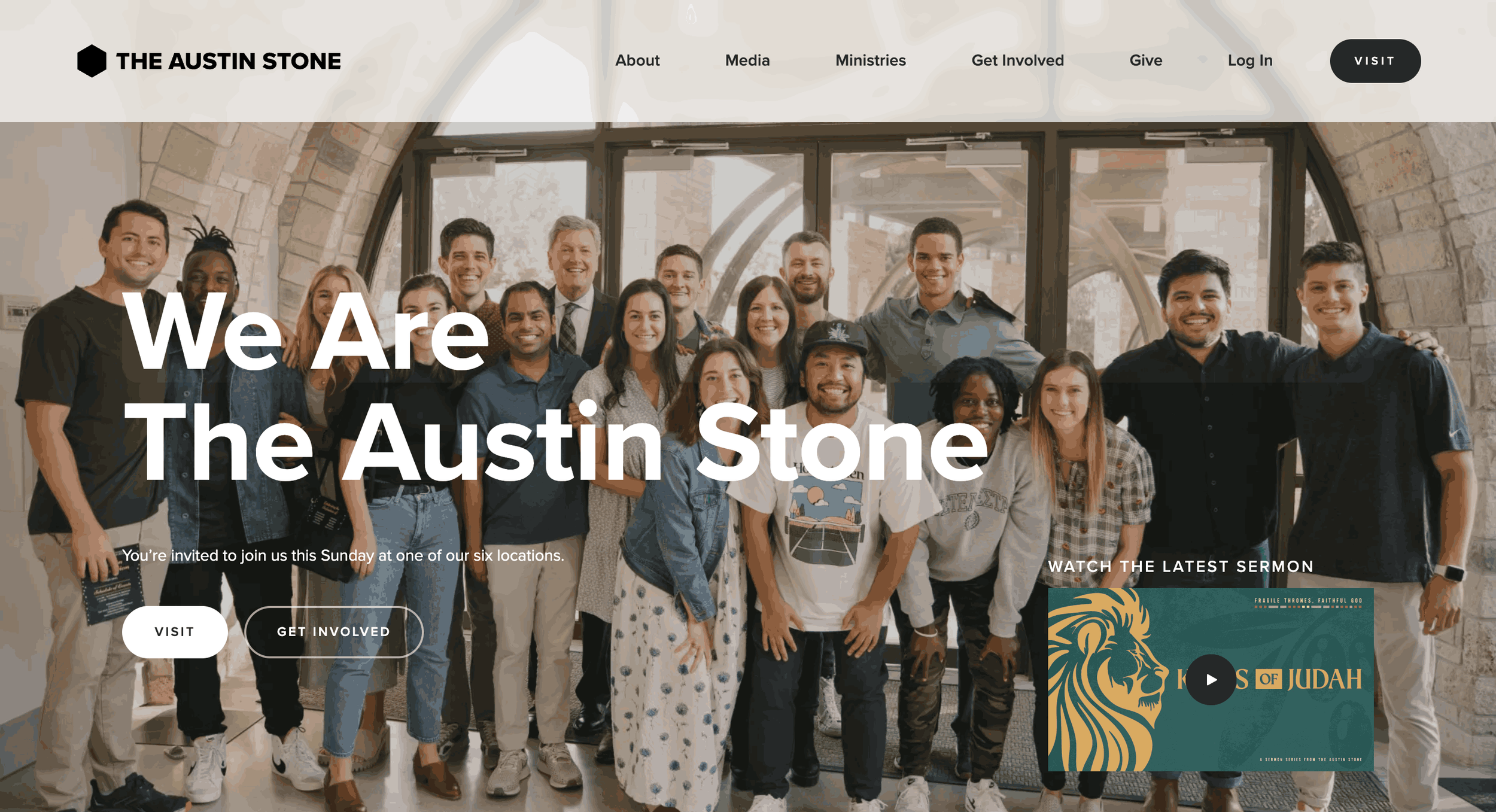
1. Location-first homepage experience ; One of the smartest things Austin Stone does is how quickly they help visitors choose a campus.
Instead of forcing users to browse the full site first, they surface campus locations early.
Visitors can quickly see:
church locations
nearby campus options
service times
directions
This is incredibly useful for first-time visitors who usually search: “Which location is closest to me?”
2. Strong sermon + resource ecosystem ; Their sermons section feels more like a media library than a typical church sermons page.
They organize content clearly through:
sermon series
speakers
topics
podcasts
written resources
This makes the site valuable beyond Sunday service.
3. Clean ministry pathways ; The website does a strong job separating ministry areas without overwhelming users.
Easy access to:
Kids
Students
Men
Women
Groups
Missions
It feels organized and intentional.
What churches can learn: If your church has multiple ministries, structure matters. People should find their ministry in seconds without digging through menus.
2. Passion Creek Church
Key Features
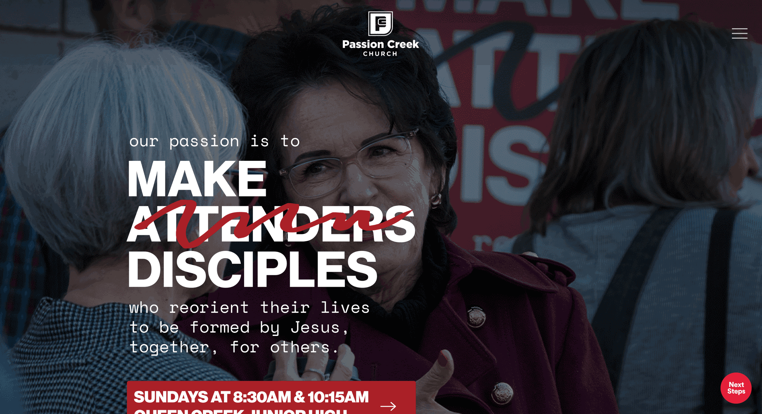
1. Strong use of photography that feels personal ; Their photography doesn’t feel like “church marketing.”
It feels real.
You see:
real worship moments
real people
candid interactions
community moments
This makes the church feel approachable immediately.
2. Homepage feels built around storytelling ; Instead of stacking random sections, the homepage flows like a story.
Visitors move through:
church vision
worship culture
ministries
ways to connect
Very natural scrolling experience.
3. Modern typography and spacing ; One of their strongest design decisions.
Large headings.
Clean white space.
Simple layouts.
This makes everything easier to read and more premium visually.
3. Elevation Church
Key Features
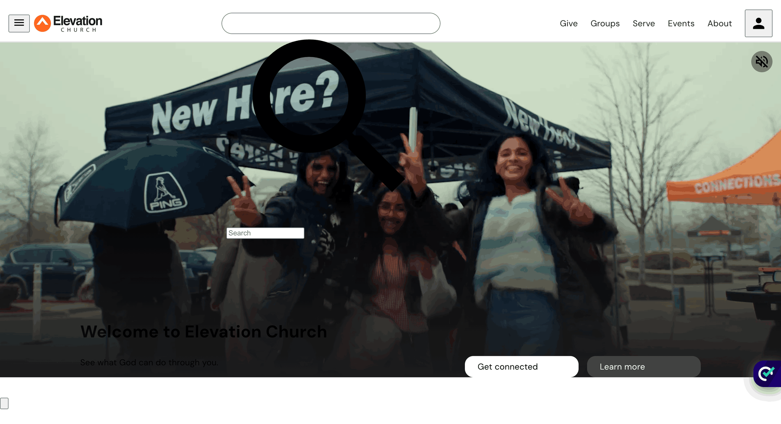
1. Strong digital-first church experience ; The website feels designed for online engagement first.
Watching messages, joining online, and exploring content feels seamless.
2. Excellent use of media across the website ; Video content plays a huge role in the experience. Messages, worship, and events feel visually dynamic throughout.
3. High-energy branding that feels consistent everywhere ; Typography, imagery and layout all feel aligned with the Elevation brand. Very polished and instantly recognizable.
4. Bay Hope Church
Key Features
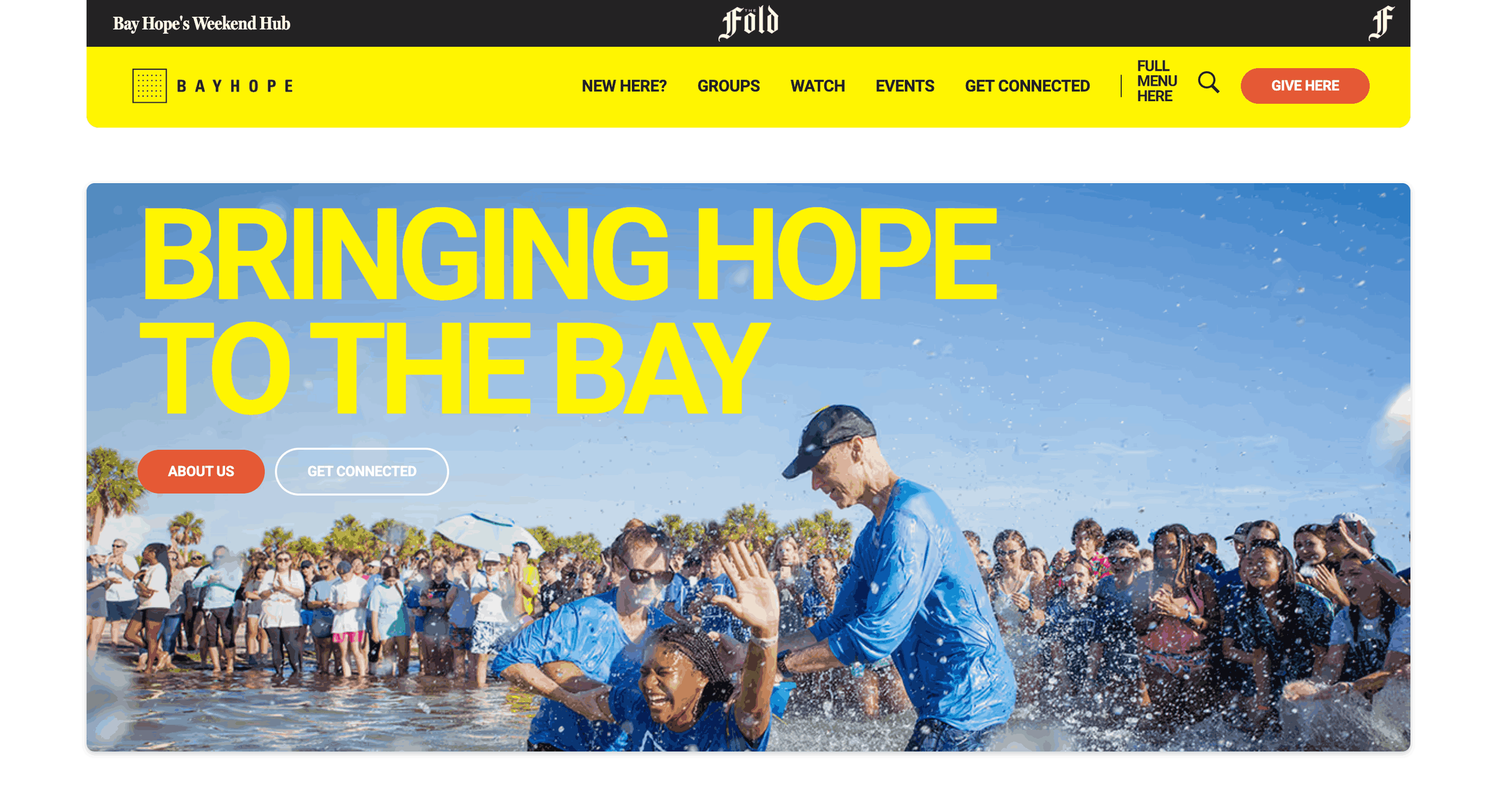
1. Strong family-first website experience ; A lot of the website feels intentionally built around families. Parents can easily find what they need quickly. This makes the experience feel very practical and useful.
2. Community engagement is visible across the design ; The website doesn’t only promote services.
It also highlights:
care ministries
support programs
outreach
local connection
That makes the church feel active beyond Sunday.
3. Easy-to-use structure with clear navigation ; Content is well grouped and easy to browse.
Visitors don’t feel lost moving through the website.
5. Church of the City
Key Features
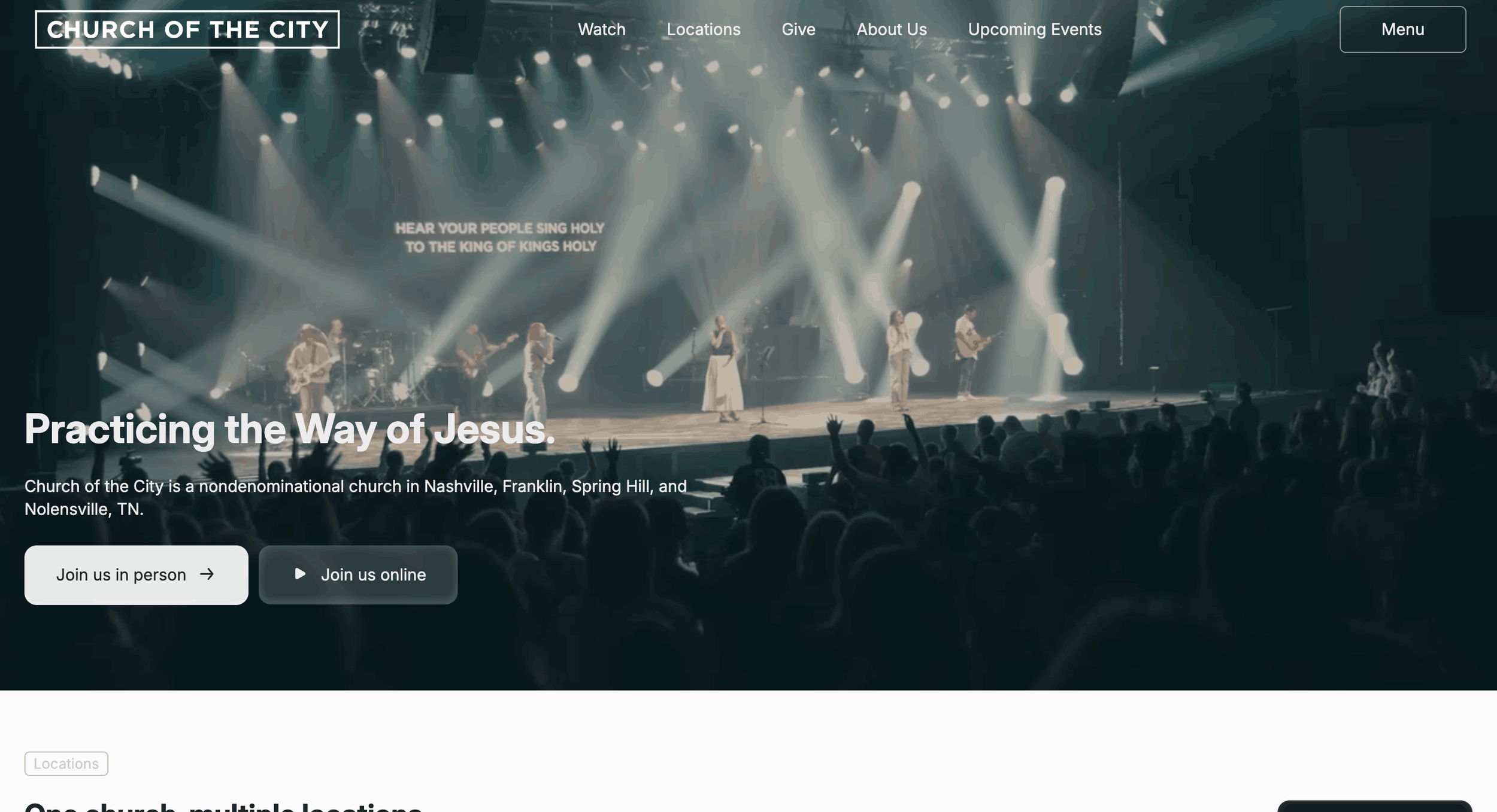
1. Clean design with excellent clarity ; The website feels calm and easy to navigate.
It never feels visually noisy.
That simplicity helps visitors focus on what matters most.
2. Great balance between information and inspiration ; It gives practical details while still feeling emotionally engaging.
You get:
church information
vision
community
teaching
without the website feeling heavy.
3. Designed with newcomers in mind ; A first-time visitor can understand the church very quickly. The path from homepage to visit feels smooth.
6. Motivation Church
Key Features
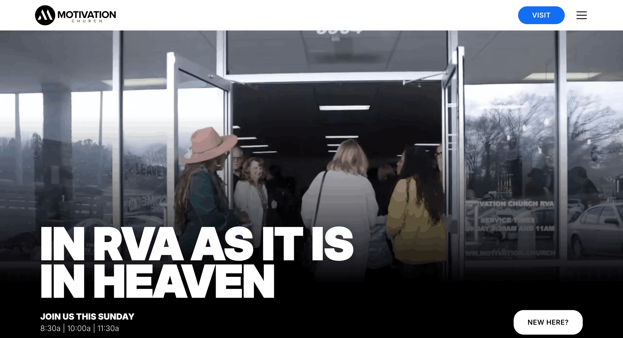
1. Bold energetic branding ; This site has strong personality immediately.
Through:
bold colors
energetic visuals
modern typography
movement throughout the page
It feels alive.
2. Youth-focused design direction ; The overall style feels intentionally younger and energetic without losing clarity.
Appeals strongly to young adults and families.
3. Clear next-step buttons throughout the site ; You constantly see action opportunities like:
visit
connect
give
join
without it feeling overwhelming.
7. VOUS Church
Key Features
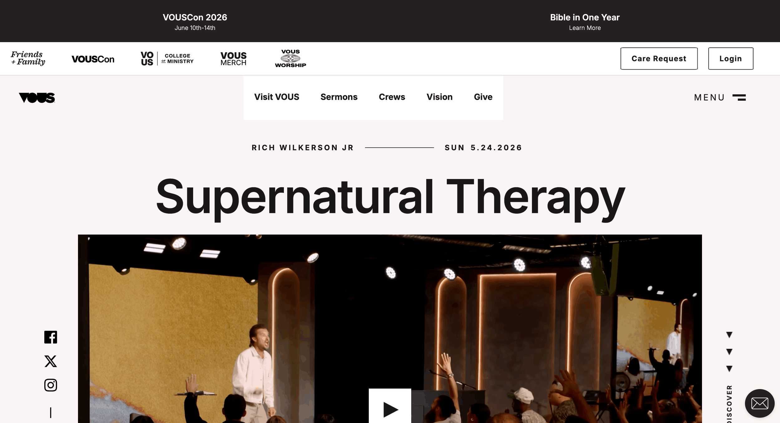
1. Strong visual identity from the first screen ; VOUS has one of the most recognizable church website styles.
The design feels:
modern
minimal
premium
creative-led
Very strong brand presence.
2. Built equally for local church and global audience ; The website serves Miami visitors while also supporting a large online audience. This creates a very scalable digital experience.
3. Content feels deeply integrated into the design ; Messages, podcasts, worship, and events all feel part of one system. Nothing feels disconnected or added later.
8. Courageous Church
Key Features
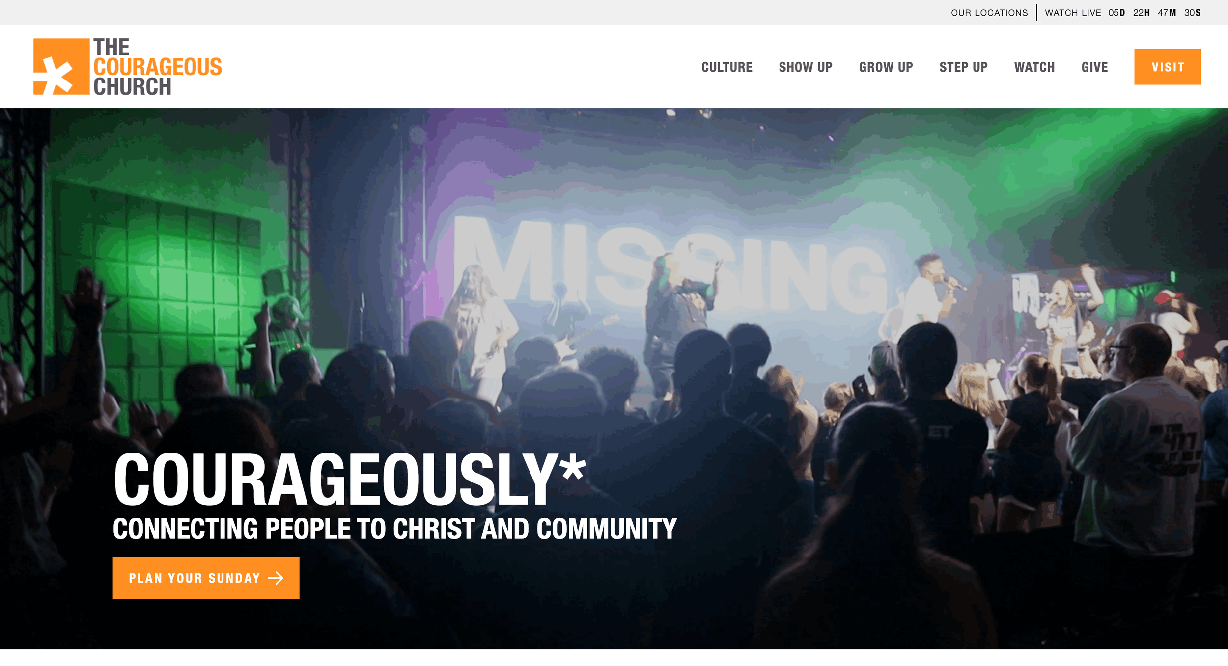
1. Designed to reduce first-time visitor hesitation ; The website answers practical questions before someone even visits.
Things like:
parking
what to expect
where kids check in
service details
This removes uncertainty and builds comfort.
2. Clear calls-to-action throughout the website ; Every section naturally encourages people to engage.
Whether it’s:
planning a visit
joining a group
registering for an event
…the next action feels obvious.
3. Bold branding creates strong identity ; The website has a confident visual style. Typography, layout, and messaging all feel energetic and intentional.
9. Vineyard Cincinnati
Key Features
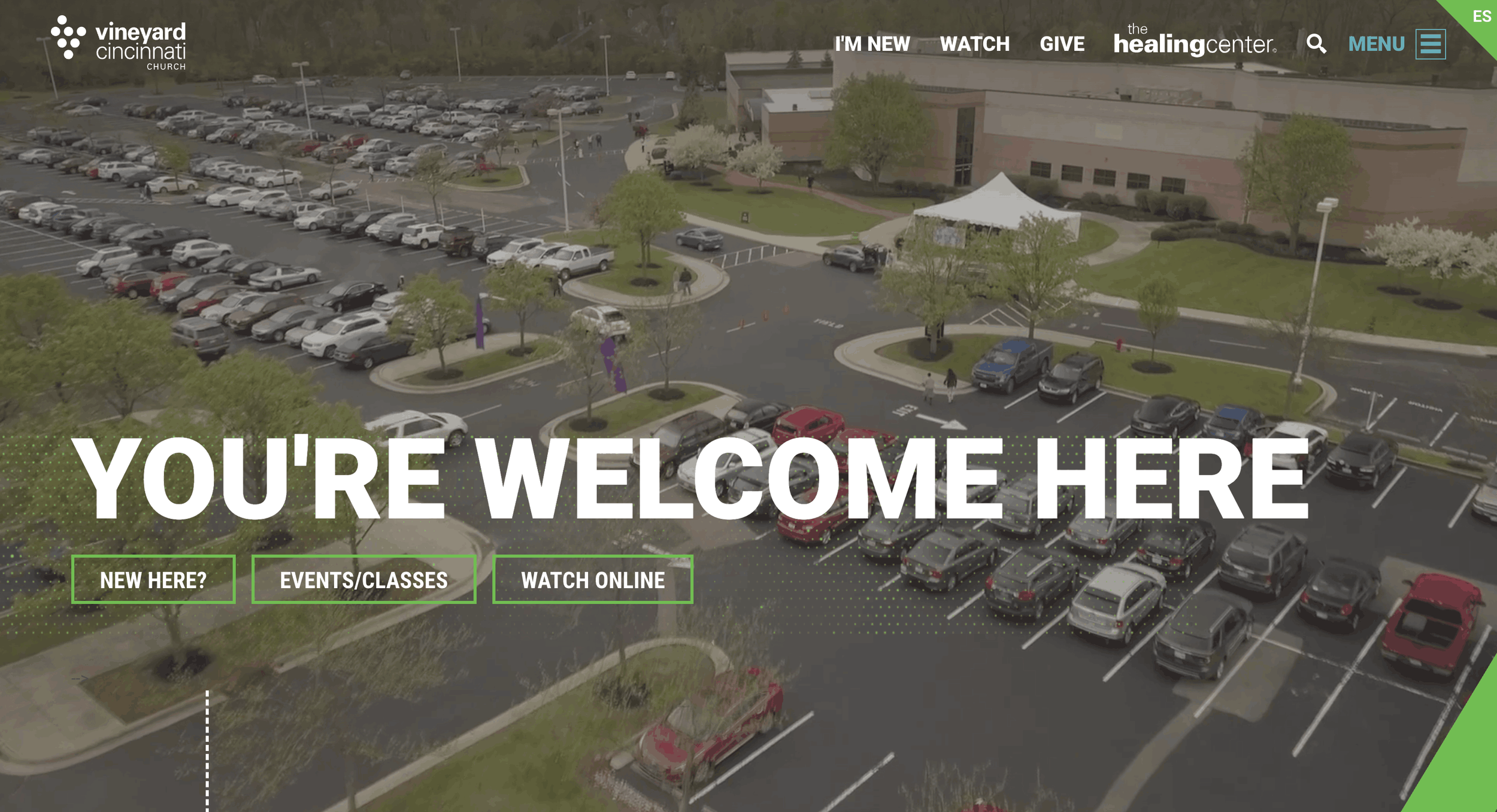
1. Very welcoming experience for first-time visitors ; The website feels open, friendly, and easy to explore. Important details are easy to find without searching too much.
Visitors immediately understand:
when to come
where to go
how to connect
2. Community is visible throughout the entire website ; The design constantly points people toward belonging.
You notice:
groups
events
outreach
ministries
It feels very community-driven.
3. Content feels approachable instead of overly formal ; The messaging feels human and conversational. That makes the church feel more accessible online.
10. Eagle Brook Church
Key Features
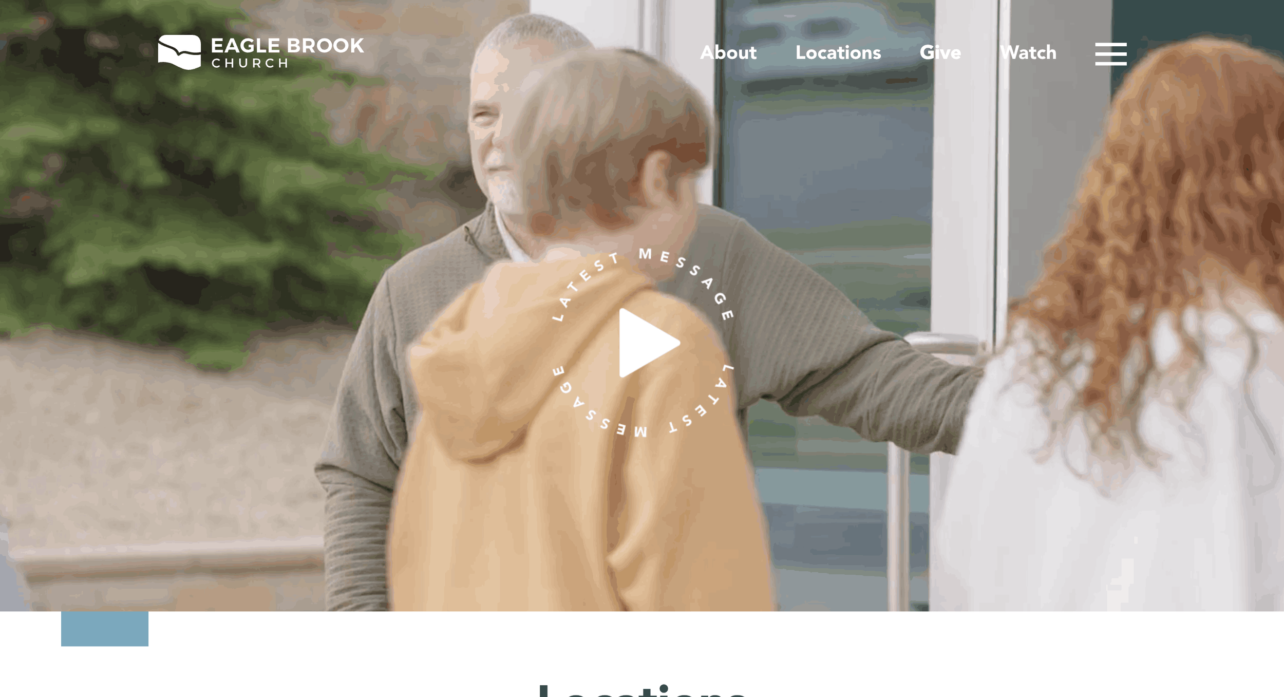
1. Built to handle a large audience without feeling overwhelming ; Even with multiple campuses, the website feels simple to navigate.
Visitors can quickly find:
service times
locations
watch live options
ways to get connected
Everything feels organized without too much clutter.
2. Strong focus on helping people take the next step ; The website is clearly designed around action.
Whether someone wants to:
join a group
volunteer
start serving
explore faith
…the next step always feels visible.
3. Digital experience feels welcoming for both online and in-person visitors ; It works equally well for someone attending online or visiting physically. This creates a smooth experience between church life and digital life.
Was This Helpful?
The best church websites aren’t always the ones with the most pages or features , they’re the ones that feel clear, welcoming, and easy to use. Sometimes small updates like better navigation, clearer messaging, stronger visuals or improved mobile design can completely change the experience.
And often, great church website design doesn’t require a full rebuild. Even a few thoughtful changes can make a big difference. Thanks for reading , I hope this gave you a few helpful ideas for your own ministry website.

Let’s Connect
Whether you’re building a new church website, redesigning your current one, or simply looking to make it feel more modern and welcoming, the right design can make a big difference in how people experience your church online.
I’m Ankush, founder of Webgoyat, and I help churches create thoughtful, modern church website designs that feel clear, welcoming, and easy to use.
If you’d like help with your website, you can explore my church website design services or book a free consultation call through my website. I’d love to hear about your church and what you’re building.
