
Church Color Palettes for Beautiful Church Branding & Website Design
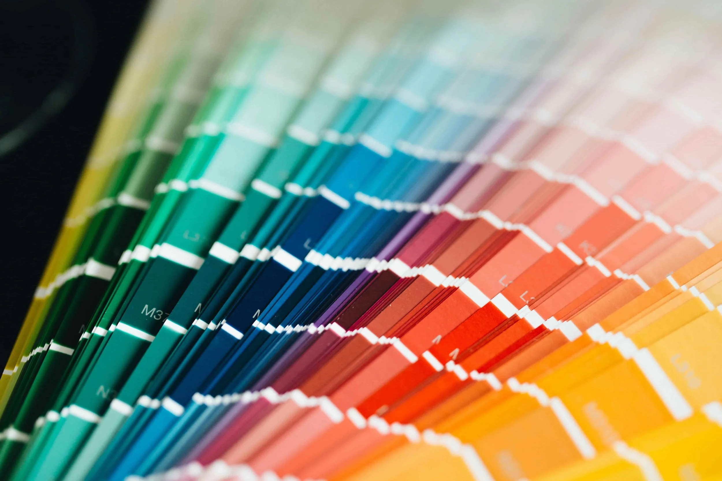
Choosing the right church color palette for a church website sounds simple, until you actually sit down to do it. I've worked on enough branding and website projects to know that selecting the right church color palettes can quickly become overwhelming. One palette feels too modern, another feels too corporate, and another simply doesn't match the church's identity.
You open a blank design file, collect a few references, save some palette inspiration… and suddenly every color starts looking either too modern, too corporate, too trendy, or just not right for the church you’re designing for.
If you’ve been there, you’re not alone. I’ve seen this happen with churches of every size , from small local congregations to modern ministry brands building a full digital presence.
And honestly, this is exactly why I wanted to write this guide. Not just to share beautiful church color palettes…
…but to help you understand why certain colors work so well in church branding, what emotions they create, and how to choose a palette that feels authentic to the church , not just visually appealing on screen. Because church colors are never just decoration. They communicate before a single word is read. Before someone reads your welcome message…
before they click “Plan Your Visit”…
before they listen to a sermon…
they’ve already felt something through the design. And color plays a huge role in that first impression.
Why Church Color Palettes Matter for Church Websites
Color affects human perception faster than text. Research in visual psychology shows that people form a first impression of a visual environment within seconds , and color is one of the strongest contributors to that response.
In branding studies, color has been shown to influence recognition, trust, emotional memory, and decision-making. For churches, that matters even more. Because a church website isn’t just promoting an organization.
It’s creating a sense of welcome.
A sense of peace.
A sense of trust.
A sense of belonging.
And those emotions are deeply influenced by visual design.
Different colors create different emotional responses:
Blue often feels calm, trustworthy, peaceful, and stable
Green feels natural, grounded, renewing, and restorative
Gold can feel sacred, timeless, elevated, and reverent
Warm neutrals feel welcoming, human, soft, and approachable
Deep burgundy or maroon often communicates tradition, heritage, and depth
White and light tones create clarity, openness, and space
That doesn’t mean every church should use the same colors. Actually , the opposite is true.
Should You Only Use “Traditional Church Colors”?
Short answer: No.
One of the biggest mistakes I see in church branding is choosing colors because they “look like church colors.” A palette can be beautiful… but still wrong for that specific ministry.
Color should support identity , not stereotype. A modern city church, a church plant for young families, a historic cathedral, and an online-first ministry will all need very different visual language. And that’s okay. A church brand doesn’t need to look traditional to feel meaningful. It needs to feel aligned.
Ask:
Who is this church speaking to?
What experience should someone feel when they arrive on the website?
What does this ministry represent visually?
Is the tone calm and reflective?
Bold and energetic?
Traditional and rooted?
Warm and welcoming?
Minimal and modern?
The strongest church brands choose colors intentionally—not because they’re expected.
How to Choose the Right Church Color Palette
When I’m selecting colors for a church website or brand system, I usually look at these five things first:
1. Start with emotion before aesthetics
Before picking colors, define the feeling. Should the website feel:
welcoming?
peaceful?
joyful?
modern?
trustworthy?
elegant?
deeply rooted in tradition?
Color should support that emotional direction.
2. Think about your audience
Different audiences connect differently with design.
A young church plant in a growing city may lean toward soft neutrals or modern earthy tones.
A legacy church with decades of history may feel stronger with richer, deeper colors.
A ministry serving families may benefit from warmth and softness.
Designing for people matters more than designing for trends.
3. Prioritize readability and accessibility
This is one many designers skip. Even a beautiful palette fails if text becomes hard to read. Church websites often include:
sermon notes
event details
giving pages
ministry information
announcements
So contrast matters. Accessibility matters. Clarity matters. If users struggle to read your content, the palette isn’t working—no matter how beautiful it looks.
4. Don’t overcomplicate the palette
Most strong church brands don’t need 12 colors. Usually:
1 primary brand color
1 secondary color
2–3 neutrals
1 accent color
…is more than enough. Simplicity creates consistency. Consistency builds trust.
5. Let architecture and photography guide your palette
This is one of my favorite approaches. Look at the church itself:
stained glass
wood tones
natural stone
lighting
interior atmosphere
signage
stage design
worship photography
Often the best palette is already present in the environment. Your website can feel far more authentic when it reflects the physical space people actually walk into on Sunday.
Below I’ve collected some of my favorite church color palettes for branding and website design—from modern minimal palettes to timeless classic combinations.
Use them as inspiration…
adapt them…
mix them…
or simply use them as a starting point for discovering what feels right for your church brand.

Great Church Websites Start With a Clear Foundation
A strong color palette is important, but great church websites are built on more than colors alone. Clear messaging, thoughtful design and a welcoming user experience make the biggest difference.
Learn how I help churches create modern websites that support their ministry goals.
1. Grace & Gold
COLOR PALETTE
About this color palette: A warm and elegant palette inspired by candlelight, faith, and timeless church interiors. Great for churches that want a welcoming and premium feel.
Hex codes in this color palette: #F8F5EE , #E7D7B1 , #C7A86D , #6F5B3E , #2F2A24
2. Deep Faith Navy
COLOR PALETTE
About this color palette: A classic church website color palette built around navy blue. Calm, trustworthy, and timeless.
Hex codes in this color palette: #F4F6F8 , #D9E2EC , #BCCCDC , #243B53 , #102A43
3. Olive & Stone
COLOR PALETTE
About this color palette: Natural green tones feel grounded and peaceful. A strong modern church color palette for churches connected to nature, community, and simplicity.
Hex codes in this color palette: #F5F3EE , #DAD7CD , #A3B18A , #6B705C , #3A5A40
4. Sacred Burgundy
COLOR PALETTE
About this color palette: Deep red often symbolizes sacrifice, love, and devotion. This is a bold but elegant choice for church branding colors.
Hex codes in this color palette: #FFF8F6 , #E6CFC9 , #B76E79 , #7F1D1D , #4A0D0D
5. Light & Sky
COLOR PALETTE
About this color palette: Soft blue tones feel open, peaceful, and uplifting.
Hex codes in this color palette: #F8FBFF , #DCEAF7 , #BFD7EA , #7AA6C2 , #2E5E7E
6. Desert Sand
COLOR PALETTE
About this color palette: Warm beige and earthy tones that feel welcoming and minimal.
Hex codes in this color palette: #FAF7F2 , #EDE0D4 , #DDBEA9 , #B08968 , #7F5539
7. Forest Hope
COLOR PALETTE
About this color palette: Fresh green with darker contrast for a grounded and modern visual identity.
Hex codes in this color palette: #F4F7F2 , #DDE5D8 , #97B28C , #588157 , #344E41
8. Royal Blue & Gold
COLOR PALETTE
About this color palette: Classic and premium. Often used in traditional church interiors and ceremonial branding.
Hex codes in this color palette: #F8F5EC , #E7C873 , #B48A3C , #1E3A5F , #0F2742
9. Warm Sunrise
COLOR PALETTE
About this color palette: A joyful yellow-based palette full of warmth and light.
Hex codes in this color palette: #FFFBEA , #FFF3BF , #F4D35E , #D4A373 , #6B4F3B
10. Plum & Stone
COLOR PALETTE
About this color palette: A rich and elegant modern church color palette with depth.
Hex codes in this color palette: #F6F0F5 , #D8C2D5 , #B497BD , #6D597A , #3D314A
11. Minimal Ivory & Charcoal
COLOR PALETTE
About this color palette: For churches that want a clean, minimal, editorial look.
Hex codes in this color palette: #FAF9F6 , #EAE6DF , #CFC8BE , #5F5A54 , #262421
Ready to Take the Next Step?
Every church is different. What works for one ministry may not be the right fit for another.
If you're planning a new church website, considering a redesign, or simply looking for guidance on branding and design, I'd be happy to discuss your goals and help you identify the best path forward.
Was This Helpful?
The best church color palettes aren't always the most creative or visually impressive ones. They're the palettes that feel authentic to the church, support its mission, and help visitors feel connected from the moment they land on the website.
A well-chosen color palette can strengthen church branding, improve the user experience, create trust, and make a website feel more welcoming and memorable.
And often, finding the right church branding colors doesn't mean reinventing everything. Small adjustments to color, contrast, and consistency can completely change how a church website feels.
Thanks for reading. I hope these church color palettes gave you inspiration and a clearer understanding of how color can support effective church branding and website design.