
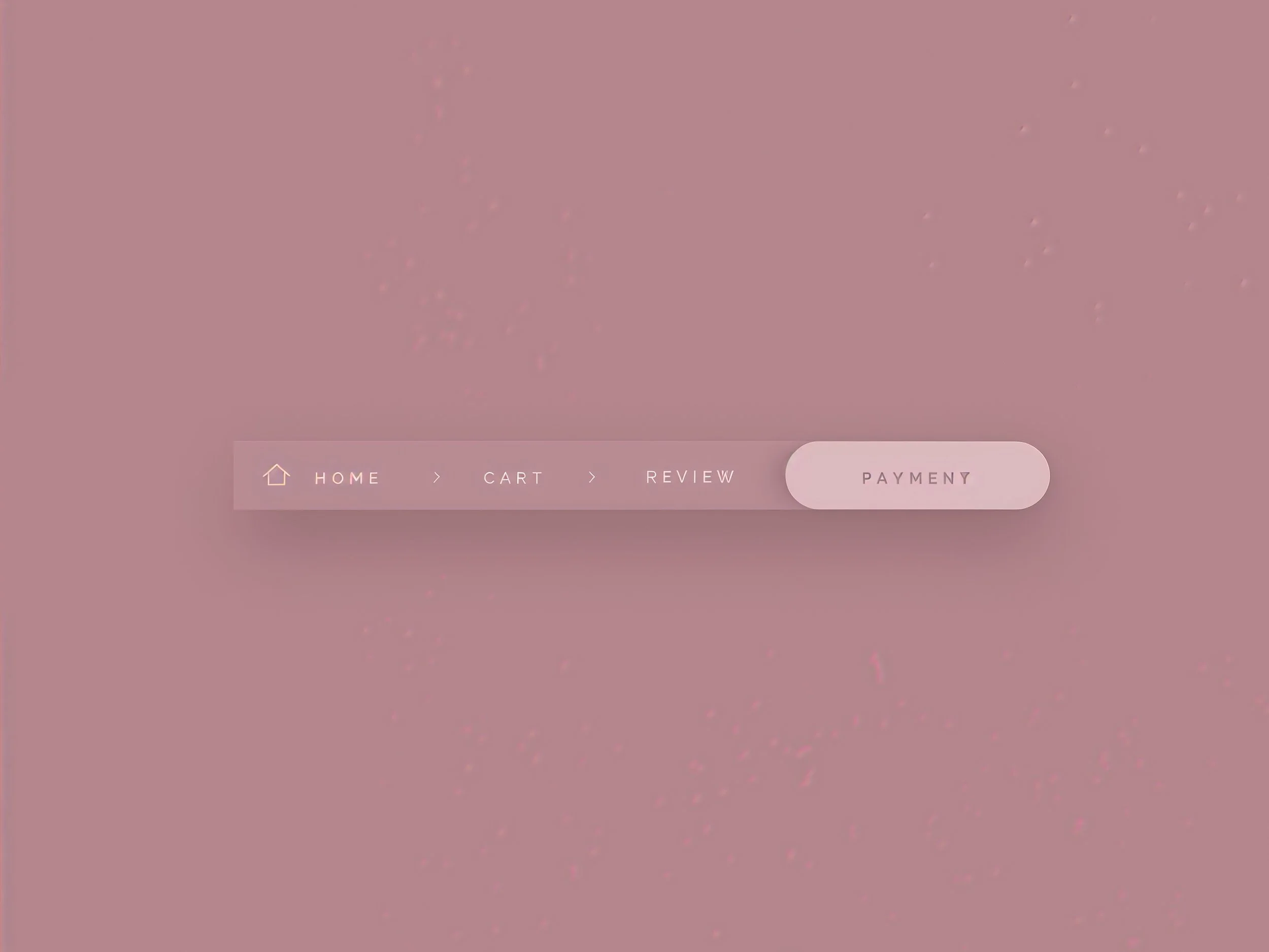
Want to give your Squarespace menu a more polished look? A Squarespace navigation hover effect can add a rounded, solid background behind a link when someone moves their cursor over it.
This pill-shaped effect adds a clear visual response without overwhelming your header. You can keep it simple with a black background and white text or adjust the colors to match your brand.
In this tutorial, you’ll learn how to create a solid pill hover effect in Squarespace 7.1 using custom CSS. No JavaScript or third-party plugin is needed.
What is a solid pill navigation hover effect?
A solid pill hover effect places a filled, rounded shape behind a navigation label when it is hovered over. For example, hovering over “About” can change the link from plain text to white text inside a black pill.
It’s a useful option if you want to:
Make interactive navigation links easier to identify.
Introduce your brand colors into the header.
Add a subtle design detail to a simple menu.
Keep the effect consistent across your main links, and choose colors that make the text easy to read.
How to add a pill hover effect in Squarespace 7.1
1. Open the Custom CSS editor
Log in to your Squarespace website and open the Custom CSS panel. Back up any existing CSS before making changes.
Paste the snippet below at the bottom of the editor, outside any existing rule or media query. Use the CSS itself without adding HTML <style> tags. Squarespace’s Custom CSS guide explains how to open the panel and save your changes.
// Solid Pill Nav On Hover //
.header-nav-item a {
background-image: none !important;
padding: 0px 10px !important;
}
.header-nav-item a:hover {
background-color: #000000 !important;
color: #ffffff !important;
border-radius: 50px !important;
padding: 0px 10px !important;
background-image: none !important;
}
2. Add the navigation hover CSS
This snippet targets direct links in the standard Squarespace 7.1 desktop header navigation. Dropdown contents, folder triggers, mobile menus, and separate header buttons may need different selectors.
The rounded corners create the pill shape, while the padding adds space around each label. Because the padding stays the same before and during hover, the effect itself does not change the link’s dimensions.
The code also includes :focus-visible styling so keyboard users can see which link is focused. This selector lets browsers show a focus indicator when appropriate, including during keyboard navigation. See MDN’s focus-visible reference.
3. Save and check your navigation
Click Save, then open your site outside the editor. Hover over each top-level link and use the Tab key to check keyboard focus.
Check the header at different screen widths, especially if your menu has several links. The added padding takes up space, so a crowded header may need smaller values.
This is a starting snippet for standard header markup; existing custom CSS and header settings can affect the result. Test it on your own site before treating it as finished.
| Property | Default | What to Change |
|---|---|---|
| Background color | #000000 | Replace with your preferred pill color in both interaction rules. |
| Text color | #ffffff | Choose a readable color in both interaction rules. |
| Padding | 6px 14px | First value controls vertical space; second controls horizontal space. |
| Border radius | 50px | Keep a large value for rounded ends. |
For a more compact menu, try padding: 4px 10px !important;. If your header uses different backgrounds on different pages, check that the pill remains easy to see on each one.
Troubleshooting the hover effect
1. The pill isn’t appearing
Check that you pasted the full snippet and saved your changes. An earlier CSS error or a competing navigation rule can interfere with the styling.
Your header may also use different markup. Folder titles and custom menus do not necessarily use the same elements as ordinary page links.
2. The menu looks too crowded
Reduce the horizontal padding from 14px to 10px or 8px. Review the header on smaller desktop widths, where the extra spacing is more noticeable.
3. An underline still appears
The snippet removes background-image styling during hover and keyboard focus. If another rule creates an underline with text-decoration, a border, or a pseudo-element, that rule needs a separate adjustment.
4. The effect doesn’t appear on mobile
This code targets desktop header links. Touchscreens do not provide a dependable mouse-style hover interaction, and Squarespace’s mobile menu uses a separate structure. Keep mobile navigation clear and usable without requiring hover.

Need Help with Your Squarespace Website?
Book a free kick-off call to discuss your project requirements in detail. Whether you're launching a new Squarespace website, redesigning an existing one, or looking to improve functionality and user experience, we'll help you explore the best options for your goals.
Frequently asked questions
-
No. You can create this pill hover effect by adding the provided code directly to your Squarespace Custom CSS editor. There’s no third-party plugin to install or JavaScript to configure. Once you save the CSS, check your desktop navigation to see how the effect looks alongside your existing header styles.
-
Yes. You can apply the effect to a single navigation link, such as “Contact” or “Book a Call,” by adjusting the CSS selector to target that link specifically. The example in this tutorial applies to matching top-level header links. To limit it to one item, use its actual link URL or another unique attribute in each relevant selector.
-
A pill hover effect is a visual enhancement, and adding it does not guarantee better Google rankings. Its main purpose is to provide clear feedback when visitors interact with your navigation. Use it as part of a thoughtful website design, while keeping your SEO efforts focused on useful content, clear page structure, and pages that answer your audience’s questions.
-
Open your Custom CSS editor, delete the snippet you added for the pill hover effect, and save your changes. Remove only that snippet so your other customizations remain intact. Your navigation should then return to the appearance determined by your existing header settings and any remaining CSS. Refresh your website to check the result.
Final Thoughts
A solid pill hover effect is a small detail, but it can make your navigation feel more polished and responsive. With the right colors, rounded edges, and balanced spacing, it adds personality while keeping your menu simple and easy to use.
For a cohesive result, match the effect to your website’s overall style. Keep your navigation labels readable, use the styling consistently, and check that the extra spacing works across different screen sizes.
Building or improving a Squarespace website? Book a free call with me to discuss your website, goals, and the improvements you have in mind. Whether you need a few thoughtful customizations or a complete redesign, I can help you create a professional Squarespace website that reflects your brand and encourages visitors to take action.
