
7 Ways to Increase Conversion Rate on Website Without More Traffic
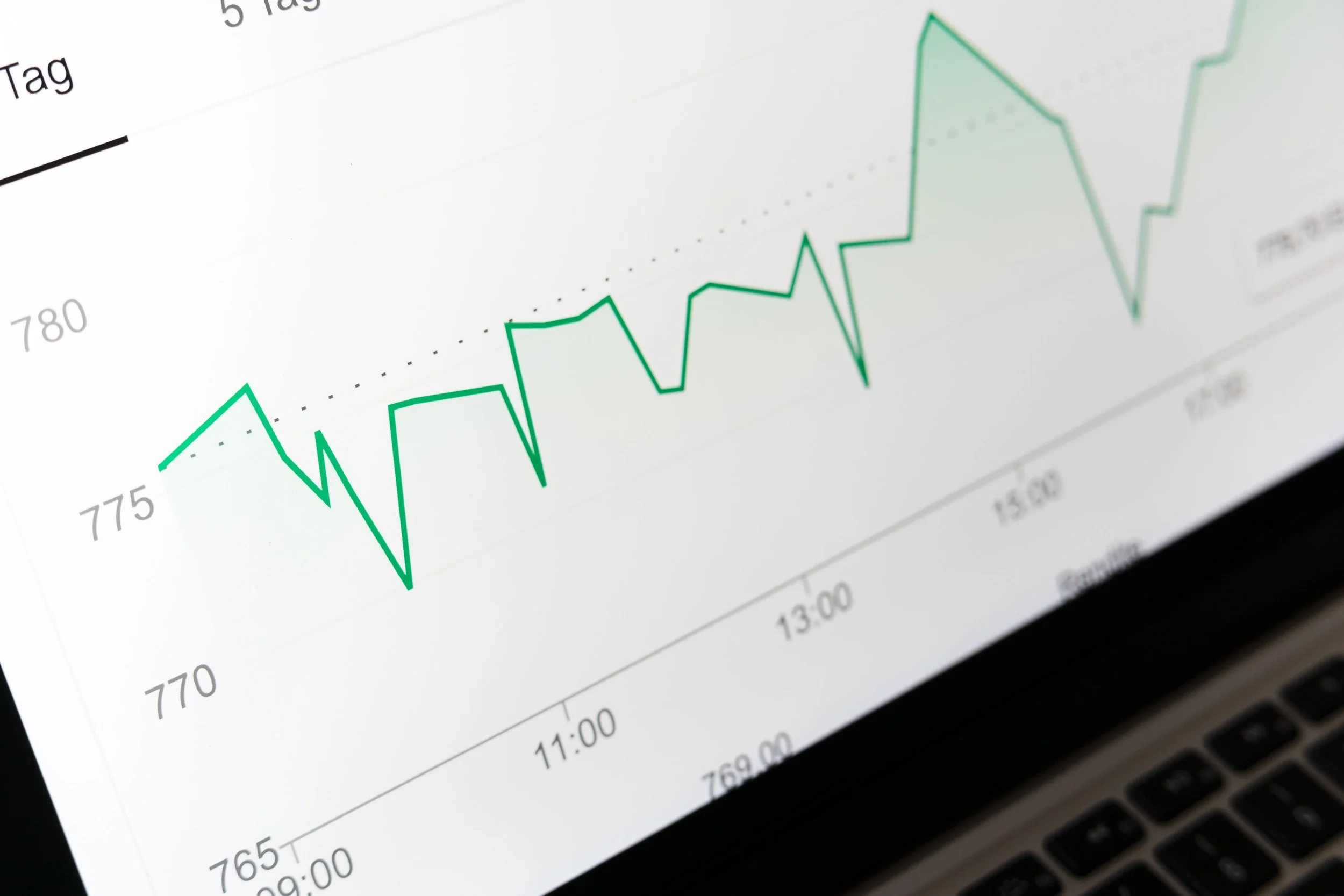
A better conversion rate starts with finding the leak that keeps qualified visitors from taking action.
Many business owners assume they need more website traffic to generate more leads. In reality, the problem often isn't traffic, it's what happens after visitors arrive.
If your website already gets visitors from Google, social media, referrals, or paid ads, every person who leaves without contacting you, booking a call, or making a purchase represents a missed opportunity.
That's why learning how to increase conversion rate on website is one of the highest-return investments you can make.
Over the past few years of designing conversion-focused Squarespace websites, we've noticed something interesting: the websites that generate the most inquiries aren't necessarily the most beautiful. They're simply easier to trust, easier to understand, and easier to take action on.
Instead of chasing more traffic, start by fixing the points where qualified visitors lose confidence.
Below are seven practical ways to increase website conversion, attract more qualified leads and convert website visitors into customers.
1. Give Every Page One Clear Goal
One of the biggest reasons visitors leave a website is because they aren't sure what you want them to do next.
Many websites try to accomplish everything at once.
The homepage asks visitors to:
Book a consultation
Read the blog
Watch a video
Download a guide
Subscribe to a newsletter
Contact the team
When every button competes for attention, none of them performs particularly well.
Instead, every page should have one primary objective.
For example:
A service business should encourage visitors to book a consultation.
An ecommerce store should focus on getting products into the cart.
A SaaS website should guide users toward a demo or free trial.
Secondary links can still exist, but your main CTA should immediately stand out.
Whenever I redesign a website, I ask one simple question: ‘‘If someone spends only 30 seconds on this page, what's the one action I want them to take?’’
If that answer isn't obvious, the page probably isn't converting as well as it could.
2. Reduce the Number of Steps Visitors Must Take
Every additional click gives visitors another opportunity to leave. Whether you're running an online store or a service business, people expect to find what they're looking for quickly.
If visitors have to search through confusing menus, jump between multiple pages, or fill out unnecessary steps, many will simply leave.
A website should guide visitors naturally from:
Landing Page → Information → Trust → Action
Nothing more.
Research by OuterBox found that simplifying website navigation for Trinity Windows increased phone calls by 10.53%, simply by making important paths easier to find.
Small improvements like these often outperform complete website redesigns.
Look for unnecessary friction such as:
Overloaded navigation menus
Hidden contact information
Too many service categories
Long booking processes
Multiple checkout steps
The easier you make the journey, the more likely visitors are to complete it.
3. Build Trust Before Asking Visitors to Commit
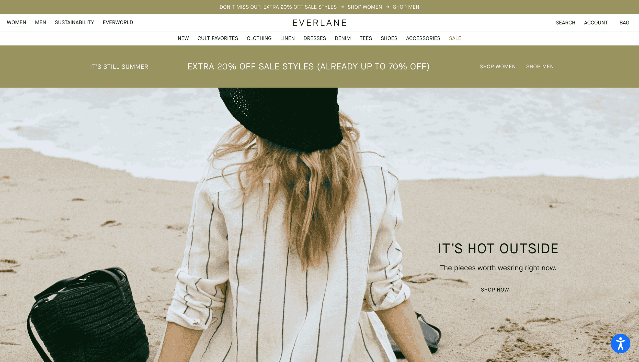
People rarely buy from websites they don't trust. Trust isn't something visitors feel after reading your About page—it's something they evaluate throughout the entire journey.
Every important page should answer questions like:
Can I trust this business?
Have they helped people like me?
What happens after I contact them?
Is there any risk?
The best-performing websites answer these questions before visitors even ask.
Some of the strongest trust signals include:
Customer testimonials
Google Reviews
Case studies
Before-and-after results
Certifications
Industry awards
Clear pricing
Real team photos
Don't hide these elements in a single testimonial section. Place them exactly where hesitation occurs.
For example, if someone is about to submit a contact form, adding a short note like: "We'll respond within one business day. Your information is never shared."
can remove uncertainty at the exact moment it matters.
Research from OuterBox also showed that improving trust elements helped increase quote requests by 70% and completed applications by 40% during one optimization project.
Trust isn't decoration. It's what moves visitors from "maybe" to "let's do this."
4. Optimize for Speed and Mobile Experience
According to Google, more than 60% of website traffic now comes from mobile devices. If your website is difficult to use on a phone, you're potentially losing more than half your visitors before they even consider contacting you.
Many business owners only test their website on a desktop computer.
Your customers don't.
Open your website on your own phone and ask yourself:
Is the text easy to read?
Are buttons large enough to tap?
Does the page load quickly?
Can you complete the contact form without zooming?
Does anything jump around while loading?
Even small usability issues can reduce online inquiries because they interrupt momentum.
Google's Core Web Vitals also reward websites that load quickly, remain visually stable, and respond smoothly to user interactions.
While speed alone won't magically improve conversions, removing friction almost always helps visitors stay engaged longer.
Simple improvements include:
Compress large images
Remove unnecessary animations
Reduce third-party scripts
Simplify mobile layouts
Keep important CTAs above the fold
Remember, visitors don't compare your website to your competitors.
They compare it to the speed and convenience they experience on every other website they visit.
Need Help with Your Squarespace Website?
Book a free kick-off call to discuss your project requirements in detail. Whether you're launching a new Squarespace website, redesigning an existing one, or looking to improve functionality and user experience, we'll help you explore the best options for your goals.
5. Reduce Friction in Forms, Carts, and Checkout
A strong CTA means little if visitors encounter obstacles when they're ready to take action.
According to Baymard Institute, the average cart abandonment rate is 70.19%. While not every abandoned cart can be recovered, many visitors leave because the process feels more complicated than expected.
For service businesses, this often means contact forms that ask for too much information before a conversation even begins.
Common friction points include:
Long contact forms
Mandatory account creation
Hidden fees or shipping costs
Confusing error messages
Slow checkout or booking processes
Ask for only the information you truly need. For most service businesses, a name, email, and short project description are enough to start.
The easier it is for visitors to take the next step, the more likely you'll increase website conversion and generate qualified leads.
Web Designer Tip:
I often see websites asking visitors to complete five or six fields that the business never actually uses. Simplifying the form almost always creates a smoother experience and can help increase website conversion without changing anything else.
6. Keep Your Marketing Message Consistent
Imagine clicking an ad that promises a Free Website Audit only to land on a page talking about general web design services. Or searching Google for Squarespace SEO Tips and arriving on a page that's mostly about branding.
That disconnect creates doubt.
Visitors expect the page to deliver exactly what brought them there.
Whether your traffic comes from: Google Search, Facebook Ads, Google Ads, Email marketing, Social media and Referrals…the message should remain consistent from the first click to the final CTA.
For example:
If your advertisement says:
Get a Free Website Consultation
Your landing page should immediately reinforce that offer with a clear headline, supporting copy, and a visible booking button.
Not every visitor starts on your homepage. Many land directly on blog posts, service pages, or landing pages.
Each page should answer three questions within seconds:
Am I in the right place?
Does this solve my problem?
What's my next step?
When those answers are obvious, visitors are far more likely to move forward.
Consistency doesn't just improve user experience, it helps convert website visitors into customers because expectations are met instead of broken.
7. Measure Conversion Quality, Not Just Quantity
More leads don't always mean better results. A contact form could receive twice as many submissions while generating fewer qualified clients. An online store could increase sales but reduce profit because of excessive discounting.
That's why successful businesses measure more than just conversion numbers.
Instead of asking:
"How many people converted?"
Ask:
"Were they the right people?"
For service businesses, track metrics like:
Qualified leads
Consultation bookings
Proposal requests
Sales acceptance rate
Closed deals
Revenue generated
For ecommerce websites, monitor:
Revenue per visitor
Average order value
Repeat purchases
Customer lifetime value
Product returns
These metrics tell a much more complete story than conversion rate alone. The goal isn't simply getting more clicks. The goal is attracting the right customers who are ready to buy.
That's how long-term growth happens.
Frequently Asked Questions
-
The seven principles of conversion are the same strategies discussed in this guide: setting one clear goal per page, simplifying navigation, building trust, improving speed and mobile usability, reducing friction, maintaining consistent messaging, and measuring conversion quality. Together, these principles help turn more visitors into customers.
-
Start by identifying where visitors drop off. Focus on one clear CTA, improve page speed, simplify navigation, reduce form friction, add trust signals, and ensure every landing page matches user intent. Small, continuous improvements often produce the best results.
-
A good website conversion rate typically ranges between 2% and 5%, depending on your industry, traffic source, and conversion goal. Rather than comparing yourself to averages, focus on improving your own conversion rate over time through ongoing optimization.
-
There's no fixed timeline. Simple improvements like clearer CTAs, shorter forms, or stronger trust signals can produce results within a few weeks, while larger changes should be measured over several months. The key is to test, track, and continuously optimize based on user behavior.
Final Thoughts
Learning how to increase conversion rate on website isn't about chasing trends or copying what another business is doing. It's about understanding why visitors hesitate and removing the obstacles that prevent them from taking action.
Sometimes, a small improvement, like simplifying a contact form, clarifying your call-to-action, or adding trust signals near a booking button, can have a bigger impact than a complete redesign.
Remember, you don't always need more traffic to grow your business. Often, you simply need to make better use of the traffic you already have.
Start by implementing these seven strategies, measure the results, and continue refining your website based on real user behavior. Over time, those small improvements compound into more inquiries, more customers, and more revenue.
