
Squarespace Accordion Block CSS: Background, Hover & Rounded Corners
An FAQ section should be easy to scan, easy to open, and comfortable to read. Its design also deserves the same attention as the rest of your website.
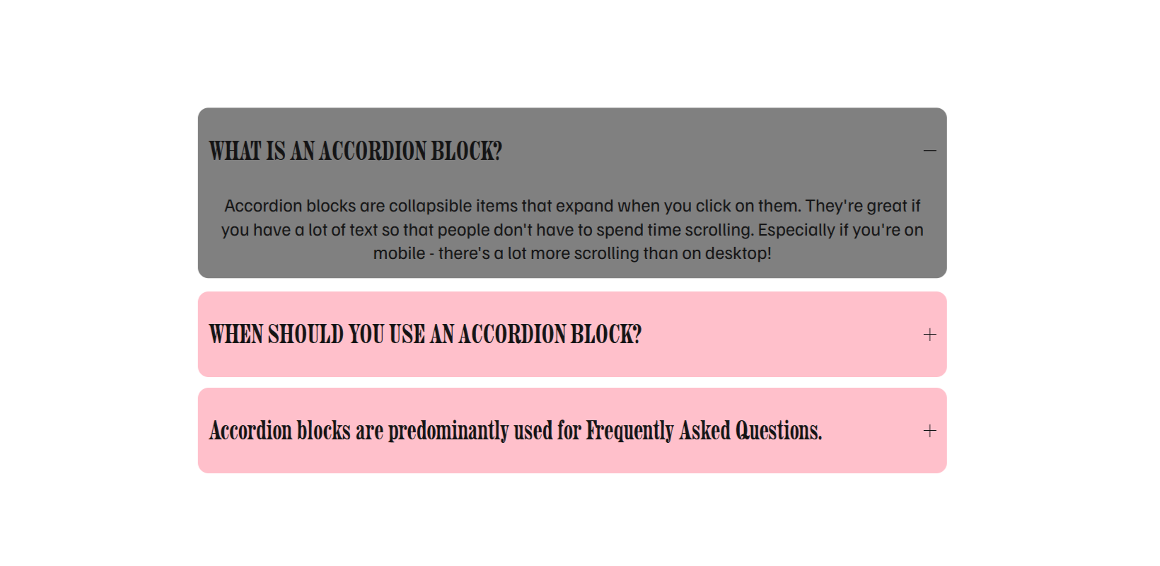
With a short Squarespace Accordion Block CSS snippet, you can give each accordion item its own background, add rounded corners, and change its appearance on hover. The result is a series of separated rows that can feel more connected to your brand.
This guide shows you how to apply the styling, adjust the colors and spacing, and optionally limit it to one Accordion Block.
What Can You Customize Without CSS?
Before adding code, check the block’s built-in Design settings. In Squarespace 7.1, you can add a background to the whole Accordion Block, adjust its corner radii and background padding, and customize elements such as dividers and icons. Squarespace’s Accordion Block guide
Those controls may be enough if you want a single background behind the entire accordion.
The CSS in this tutorial creates a different layout: each accordion item gets its own colored background, rounded corners, and space underneath it. Hovering over an item changes its background and moves it upward slightly.
Step 1: Add Your Accordion Content
Edit your page and add an Accordion Block, or open one you already use. Enter your questions or section headings as item titles, then add the supporting text in each description. Squarespace’s instructions for accordion content
For an FAQ, write titles that describe real questions. “How long does a website redesign take?” tells visitors more than “Project information.” Keep each answer focused enough that people can find what they need without opening several unrelated items.
Add at least one longer answer before styling. This helps you check how the design looks when an item expands, rather than judging only the collapsed rows.
Step 2: Add the Custom CSS
Open your site’s Custom CSS panel. Paste the following snippet after your existing code, outside any other rule, and save your changes. You can find guidance on using the editor in Squarespace’s Custom CSS documentation.
This version affects matching accordion elements across your website. If you only want to style one block, use the scoped version later in this guide instead.
/* Accordion: Background + Border Radius + Hover */
div.accordion-divider {
    display: none;
}
li.accordion-item {
    background-color: pink;
    margin-bottom: 12px !important;
    border-radius: 12px;
    padding: 0px 12px !important;
}
li.accordion-item:hover {
    background-color: grey !important;
    transform: translateY(-3px);
}
What the Code Changes
The first rule hides matching accordion divider elements. The second gives each item a pink background, a 12-pixel corner radius, and a 12-pixel bottom margin.
The padding adds 12 pixels inside the left and right edges of the item, with zero top and bottom padding on that element. Inner accordion elements can still have their own spacing, so this does not remove every bit of vertical space within a row.
The final rule changes the background to grey and visually shifts the hovered item upward by 3 pixels. It does not open the answer automatically or change the accordion’s click behavior.
The supplied code does not add a transition. Unless another style provides one, the hover change is immediate. An optional transition is included below if you want a gradual effect.
Step 3: Match the Colors to Your Website
Replace pink and grey with your preferred CSS colors. For example, you could use #f7c6d9 for the normal background and #efd5df for a softer hover change.
Change the color values inside the existing rules:
/* Normal item background */
background-color: #f7c6d9;

/* Hover background */
background-color: #efd5df !important;
These are individual declarations to edit, not a complete replacement snippet.
Check the title, answer text, links, and expand icon against both backgrounds. This CSS changes the background but does not set the text or icon colors. A dark hover background can make existing dark text difficult to read.
Start with two colors that work with your current text styling. You can then refine the contrast alongside the rest of the section.
Step 4: Adjust the Corners and Spacing
Use border-radius to control how rounded each row looks. Try 6px for a subtle curve, keep 12px for the original effect, or use 0 for square corners.
The margin-bottom value controls the gap after each item, including the last one. Reduce it if the accordion feels too spread out.
To give the content more horizontal room inside its background, change the padding to 0px 20px. Check narrow screens afterward: additional padding leaves less space for long questions and may cause more text wrapping.
Match these choices to nearby buttons and content panels. An accordion usually feels more integrated when it shares a few design details with the rest of the page.
Optional: Soften the Hover Animation
Add this line inside the li.accordion-item rule if you want a gradual color change and upward movement:
transition: background-color 0.2s ease, transform 0.2s ease;If you prefer no movement, remove transform: translateY(-3px); from the hover rule. The background can still change without shifting the item.
Optional: Style Only One Accordion Block
For a single FAQ section, use a Squarespace ID Finder to copy the Accordion Block’s ID.
Use the following version instead of the site-wide snippet, replacing #block-YOUR-ID in all three selectors with the actual ID:
/* Style one Accordion Block */
#block-YOUR-ID div.accordion-divider {
    display: none;
}

#block-YOUR-ID li.accordion-item {
    background-color: pink;
    margin-bottom: 12px !important;
    border-radius: 12px;
    padding: 0px 12px !important;
}

#block-YOUR-ID li.accordion-item:hover {
    background-color: grey !important;
    transform: translateY(-3px);
}
Prefixing every selector matters. If you only add the ID to the background rule, the unscoped divider and hover rules can still affect other accordions.
Step 5: Test the Accordion on Desktop and Mobile
Preview the saved page outside the editor. Open and close several items, including the longest answer, and check any links inside them.
Focus on three things:
Readability: Titles, answers, and icons should remain visible on both background colors.
Spacing: Expanded content should fit comfortably without overlapping nearby elements.
Interaction: Check taps on a phone and keyboard operation with Tab, Enter, and Space where applicable; keep the visible focus indicator.
Hover is not consistent on touchscreens. Depending on the browser, it may appear briefly, remain after a tap, or not appear at all. Keep the accordion useful without its hover styling. MDN’s hover reference
Why Isn’t the Accordion CSS Working?
If nothing changes, first confirm that you are styling a native Accordion Block. Another component that looks similar may use different classes.
Next, check for missing braces and make sure you pasted the snippet outside existing CSS rules. If you used the single-block version, verify all three copies of the Block ID.
If only some styles appear, look for earlier accordion customizations that target the same properties. Native block backgrounds may also remain visible behind the individual item backgrounds. Review the built-in background setting if you see an unexpected outer panel.
Save and refresh after making a correction. Clearing your browser cache is not a substitute for fixing an incorrect selector or conflicting CSS.
Frequently Asked Questions
-
Yes. Squarespace 7.1 provides a built-in background option for the whole Accordion Block. This tutorial uses CSS for separate backgrounds on individual items and a hover treatment. Choose the approach that matches whether you want one continuous panel or separated rows.
-
The original snippet uses broad class selectors, so it affects matching elements across your website. To limit the styling, use the version with a Block ID and replace the placeholder in every selector. Remove the broad version when switching to the single-block approach.
-
The hover rule follows the pointer, not the open or closed state. An expanded answer will not necessarily keep the hover color when you move away. Styling an item specifically because it is expanded requires a separate selector for that state; this snippet does not include one.
-
Yes. Remove the div.accordion-divider rule from whichever version you use. Also check the block’s native divider settings, because removing CSS that hides a divider will not enable one that is already turned off in the editor.
Final Thoughts
A well-designed accordion makes supporting information easier to browse. Separate backgrounds can help distinguish questions, while restrained spacing and rounded corners can connect the section to your brand.
Keep the styling simple enough that the content stays easy to read. The most useful FAQ section combines clear questions, helpful answers, and a layout that works comfortably across devices.
Building or improving a Squarespace website? Book a free call with me to discuss your website, your goals, and how I can help turn your ideas into a professional Squarespace website designed to convert visitors into enquiries.
Why Customize the Accordion Block?
Customizing your Accordion Block can:
Make your content sections stand out with your brand’s colors
Create a more interactive hover effect for better user engagement
Add smooth rounded edges that match your site’s modern design
Maintain a clean, minimal layout while improving visual appeal
These small design enhancements can make your Squarespace website feel truly bespoke and more aligned with your brand identity.
Step 1: Add the Custom CSS
To style your Accordion Block, follow these steps:
Go to your Squarespace dashboard.
Navigate to Design → Custom CSS.
Paste the following code snippet:
/* Accordion: Background + Border Radius + Hover */
div.accordion-divider {
    display: none;
}
li.accordion-item {
    background-color: pink;
    margin-bottom: 12px !important;
    border-radius: 12px;
    padding: 0px 12px !important;
}
li.accordion-item:hover {
    background-color: grey !important;
    transform: translateY(-3px);
}
Step 2: Customize the Colors and Spacing
You can easily modify this CSS to match your site’s style:
Change “pink” and “grey” to any color code (for example,
#f7c6d9for soft pink or#222for dark grey).Adjust border radius — increase to
20pxfor a more rounded look or set to0for square corners.Tweak padding and margin values to control spacing around and within each accordion item.
Step 3: Preview and Test
After adding your CSS, open any page that includes an Accordion Block and hover over it. You’ll see:
A subtle background color
Rounded corners
A hover color that changes when you move your cursor over it
If you don’t see changes right away, try refreshing your browser or clearing your cache.
Step 4: Keep Your Design Consistent
When applying custom styling to elements like accordions, it’s best to use consistent colors and corner radii across your website. This maintains a cohesive design language and ensures everything feels intentional.
Wrapping Up
Customizing the Accordion Block in Squarespace is an easy yet effective way to make your content feel more branded and interactive. With just a few lines of CSS, you can add background colors, hover effects, and rounded corners that bring a professional, cohesive touch to your design—without needing advanced coding skills.
Want help refining your Squarespace site or adding custom CSS features like this?
Get in touch with me here — I’d be happy to help you create a clean, modern, and on-brand Squarespace experience.

Your Designer
I'm Ankush, a Squarespace web designer and founder of webgoyat. I have worked with all types of businesses and organizations from preschools to publishing companies to chiropractic clinics and everything in between. If you want to discuss a potential project, you can email me at info@webgoyat.com or get in touch with me here. Alternatively, you can book in a free 15-minute consultation call here.
